Few months ago, I wrote an article on Grid, with the title – “What can I do with a GridPanel in ExtJS”. I was getting a few requests to put similar article for the Charts as well. Hence, in this article, I have tried to summarize the various things that you can do with ExtJS charts. Of course, you must refer to ExtJS docs for completeness and getting hold of the latest APIs. Like the article on GridPanel, my primary target audience is again business users who want to understand if certain charting capabilities are feasible off-the-shelf or not. While of course I have focussed more on ExtJS in-built capability, I will also be covering some of the components which exist in market place so that you know the different options available at relatively low cost.
Pre-requisites
This article assumes that you are familiar with basics of ExtJS.
Also, I am assuming that you are familiar with the drawing capability of ExtJS / Sencha Touch. In case you do need some familiarity with drawing package then I will recommend you to visit following pages
- http://docs.sencha.com/extjs/4.2.2/#!/guide/drawing
- http://blogs.walkingtree.in/2013/04/20/using-draw-package-in-sencha-touch/
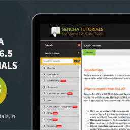
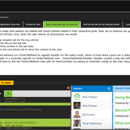
In case you are a business user then you can skip the code part. For the demonstration purpose, I have used Sencha Tutorial (http://senchatutorials.in/), however, you can choose whatever tools suits you better or perhaps you can try these concepts in your own project.
What are the available options?
Charting is one of the key component of ExtJS framework. The ExtJS chart classes use the surfaces and sprites developed with the drawing package and enables developer to write code which assists in the graphical visualization of the data. It comes with a lot of off-the-shelf charts to meet most of the common need. Also, it allows the developers to extend the existing charting capability to build their own charts.
Types of charts available off-the-shelf
ExtJS comes up with following types of charts off-the-shelf:
In case you do want to play with the charts and see how it works then do visit the links shared under each chart type. Following image shows most of the off-the-shelf charts available in ExtJS and clicking on the image will take you to the Sencha Demo page: 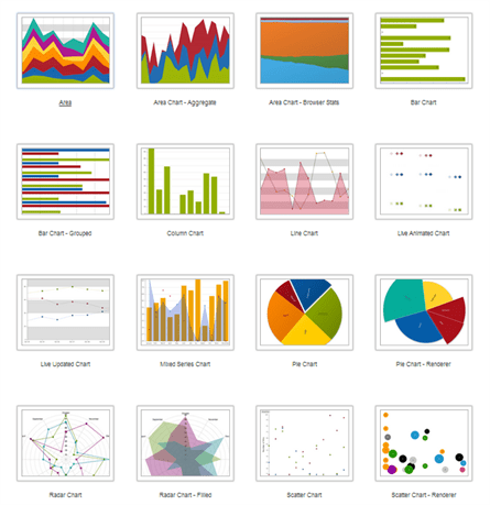
Components of charts
Before we delve further into Charts, let’s understand the basics behind this. Since you are here, I am assuming that you do understand that charts allow you to visualize your data better. Also, it is obvious that the data is drawn on an axis (numeric, category, time or gauge) using a series (line, bar, pie, are, etc), which allows data to be drawn in a specific way. In nutshell, the minimum stuff that you need to be able to draw a chart are data, axes and series. Depending on the visualization need, a chart may have one or more axes and one or more series in it.
ExtJS package structure shown below shows the axes and series available as part of the framework: 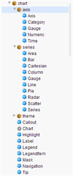 In order to create a chart, you often go through following steps:
- Identify your data
- Define data model
- Define store and load your data in that store
- Create an object of the class “Ext.chart.Chart”
- Configure axes
- Configure series and
- Customize the default look, behaviour and interactions
The typical code structure for creating a chart resembles a format shown below:
1 2 3 4 5 6 7 8 9 10 |
<span style="font-family: Rubik;">{ xtype: 'chart', animate: true, store: dataStore, gradients : [ ... gradient options ...], theme : 'Green', legend: { ... legend options ... }, axes: [ ...axes options... ], series: [ ...series options... ] }</span> |
- Creation of bar chart
- Applying gradients
- Changing the position of the bar
- Styling
- Showing tool tips on a series
- Showing bars in a group
- Stacked bars
- Playing with legends
- Customizing labels
- Showing grid and colours
- Savings charts as an image
- Creating and applying a new theme
- Animating a bar chart
The following video shows the sample screens of the Sencha tutorials: [wpvideo IvVmsK40] Of course you can look at the other tutorials inside Charts to understand following functionalities:
- Usage of more than two series (for example two lines)
- Highlighting a marker and series on mouse over
- Grid with horizontal and vertical lines (typical grid)
- Usage of two axes
- Zooming the graph
- Having donut and needles
- Highlight specific section of a pie chart
- Defining label for the different section of the pie
- Mixing up different types of charts
- Handling events
- etc
Further, you can look at the Sencha Doc’s Chart Guide, which is an excellent resource to know more about charting capability of ExtJS. In addition, you can look at the Chart Examples in Sencha doc to see a few really cool samples. I really liked the following samples:
- Live Updated Charts
- Live Animated Charts
- Rich Tips
- Custom Bar Charts
- Custom Pie Charts
- A dashboard consisting of charts
Custom Chart components/frameworks available in the marketplace
So far we have seen different types of charts and related charting features available off-the-shelf. However, ExtJS developers are continuously working towards making the framework richer by creating plug-ins, components, etc. In this section, I will be listing out some of the charting extensions available in the market place, which you can acquire either free of cost or for a nominal fee.
WTC eStore
Walking Tree’s eStore has a lot of ExtJS components and it has started adding Charts components as well. Following images shows sample CandleStick and OHLC charts
You can purchase this component by visiting Walking Tree’s eStore.
HighCharts
Highcharts is a charting library written in JavaScript, offering an easy way of adding interactive charts to your web site or web application. You can download highchart library from here and demo can be seen here. Following image shows some of the examples of the high chart, but it is worth viewing their demo page: 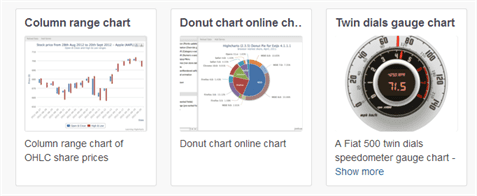
Gantt Chart
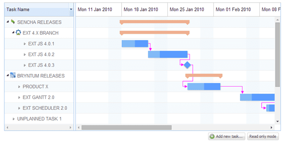
With bryntum’s Ext Gantt Chart you can manage your project schedules very easily inside your web application. The user interface is intuitive and interactive and allows the user to work with both the mouse and keyboard. You can see a demo here and several examples of the Gantt chart usage has been listed here. Following is a sample screen:
Displaying threshold lines
Following URL has a discussion and related code on the displaying Threshold Lines and Color Ranges on Cartesian style charts: https://www.sencha.com/forum/showthread.php?250596-Threshold-Lines-and-KPI-Ranges-for-Cartesian-and-Radar-Charts
Candle Stick Chart
EdgeUX.chart.series.Candlestick enables you to draw candlestick chart, whose demo (including source and data) can been seen here. Below image shows a sample candlestick chart using this component:
Also, by applying different themes you can choose to have red/green, blue/gray, black / white, etc combinations for the candlestick.
AM Charts
AM Charts offer JavaScript/HTML5 charts for most of your needs. The set includes serial (column, bar, line, area, step line, step without risers, smoothed line, candlestick and ohlc graphs), pie/donut, radar/polar, y/scatter/bubble, Funnel/Pyramid charts and Angular Gauges. You can view the demo here. They have also got a very well documented tutorial for using the chart, which you can access here. While I haven’t seen a well documented case study of AM Charts being used inside an ExtJS Application, nevertheless, being written in Javascript and HTML5, AM Chart does provide you an option to think about.
Fusion Chart
Similar to AMCharts, the fusion charts also comes up with comprehensive lists of inbuilt charts. The samples can be seen here.
Also, when you are exploring charting options, it doesn’t hurt to take a look at the Charting Framework Comparison on wiki and on fusion chart’s website.
Summary
In this article I have tried to cover the different charting options available – off-the-shelf as well as custom components / frameworks available in the marketplace. By looking at the options it does look very exciting to be building applications in ExtJS and visualizing data in the desired way. The training tools like Sencha Tutorials and Sencha Docs enables you to understand the mechanics of graphs relatively easily. I hope this article helps you to take better advantage of the charting capability of ExtJS.
References
- http://dev.sencha.com/deploy/ChartsDemo/
- http://senchatutorials.in/
- http://docs.sencha.com/extjs/4.2.2/#!/guide/charting
- http://vimeo.com/33431660
- http://vimeo.com/17673342
- http://miamicoder.com/ext-js-tutorials/
- http://www.slideshare.net/senchainc/charts-5971878
- http://joekuan.wordpress.com/2012/11/24/highcharts-extension-for-sencha-extjs-4-and-touch-2/
- http://www.sencha.com/blog/ext-js-4-preview-drawing-and-charting/
Hey Alok – long time…. how have you been? Looks like you are in Hyderabad. I am scheduled to be there on the weekend of 10th May. If you are around, would love to catch-up. Don’t have your contact info. Hence the comment on this forum.
Most useful post, hoping for Gantt chart implementation should be in ExtJs 5.* versions. As of now it is payable .