


Blogs
Basic components of technical analysis
Problem Statement
Technical analysis does reveal quite a few details which are very helpful in taking calculated risks in the share market. However, many times the topic looks overwhelming to the trader and available information makes it further difficult to understand the concept. While learning about the functional aspects of trading, I have faced similar problems and as part of my learning, I took a note which I thought of sharing as a blog. I hope it helps you in understanding the basic concepts.
Technical Analysis
Technical analysis is primarily the visual illustration of the tussle between buyers (demand) and sellers (supply). As you would expect that the stock’s price, of course, depends on company’s fundamentals, however, there are certain market driven data mixed with emotions of the buyer/seller which throws a lot of interesting charting scenarios. They are called a charting pattern and most of the pattern when combined with technical indicators/oscillators, provide a certain clue about the movement of the stock price. Of course, this forms the core part of the technical analysis, whose purpose is to predict (hence it is probability and not certainty) future price and trend.
Technical charting depends on two inputs
- Historical Prices
- Volume (number of shares traded)
Technical Analysis works on following human emotions with the basic intention of “Buy low sell high”
- Greed
- Hope
- Fear
Following basic shapes/patterns are very important in understanding charts:
- Demand Area: Demand is an area where there are more buyers (of the number of shares) than sellers. This indicates that prices are expected to go up and this could lead to a buying opportunities.
- Supply Area: Supply is an area where there are more sellers than buyers (of the number of shares). This indicates that prices are expected to come down and this could lead to a profit booking/stop loss opportunities.
- Basing Area: Basing is an area of indecision where buyers and sellers are equally strong and they are not able to drive price in any specific direction (up / down). Since this is an area of consolidation, people often wait for a breakout – positive (for a long trade) or negative (for short trade)
Technical Analysis works on following assumptions and market principles
- Everything gets discounted in terms of price
- Demand and Supply drives the prices
- When the same demand/supply area is being hit again and again then they often become weaker
- A demand area once broken, it acts as a supply zone (i.e. Role Reversal)
- Similarly, when a supply area is broken then it acts as a demand zone (i.e. Role Reversal)
- A recent demand/supply area is considered stronger than the demand/supply area of past (i.e. Recent is Stronger)
- History tends to repeat
- Price moves in trends (up trend, down trend, side-ways)
Note
Often when you buy in demand zone, you put a stop loss below the demand area. Note that once the demand area is broken it acts as a supply zone and you sell in the supply zone. Similarly, when the supply area is broken, it becomes a demand zone and gives you an opportunity to buy as up trend is generally expected.
Mainly there are three components of technical analysis
- Charts
- Indicators and
- Overlays
Types of Charts
There are various types of charts being used in technical analysis. Some of the charts are listed below:
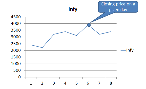
Line Chart
This is often obtained by connecting the closing prices for a given period. Sometimes the color of the line segments is decided based on the price difference between two periods – i.e. if the price goes high then green color otherwise red color.
Bar Chart
This is obtained using the high, low, open and close price in a given period. They are also known as OHLC chart.

Candlestick chart
This is again based on High, Low, Open and Close. However, it gives you a different visual, which resembles like a candle with color differentiating the low/high explicitly. 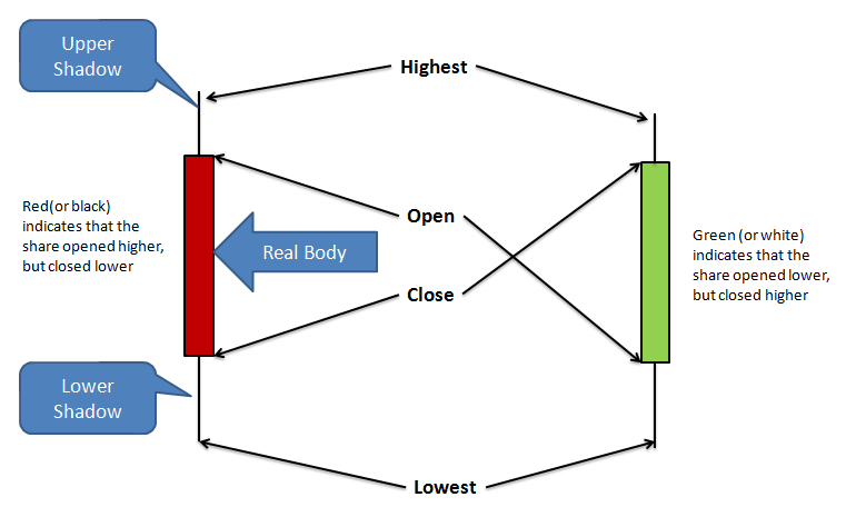
Difference between bar chart and candlestick
While the bar chart (OHLC) and candlestick chart depends on OHLC prices, the following differences must be noted
- In the bar chart, the color of the bar is decided based on the difference between the closing price of the current period with the previous period. However, in the case of candlestick the color is decided based on the opening price and closing price in a given period.
- In the bar chart emphasis is on high and low, while in candle stick emphasis seem to be more on open and close
Technical Indicators
Indicators that are used in technical analysis to identify momentum, trends, volatility and money flow of security. They are calculated using the price and volume details and often two or more indicators are combined with the price specific charts (line /bar/candle stick) to predictively take a decision on buy/sell/ hold.
There are two categories of indicators:
- Range-bound or also known as oscillators – for example, Relative Strength Index
- Non-range bound – for example Volume
Following are the list of commonly used indicators:
- Accumulation / Distribution – This indicator assists in identifying a pattern, which indicates if investors are buying (accumulating) or selling (distributing). For example, if a price goes high on a high volume in a down trend then it can indicate that the price reversal may be on the card as people may have started accumulating.
- Average Directional Index – This indicator assist you in identifying the strength of the trend. Note that it doesn’t help you in identifying the trend.
- Moving Average Convergence Divergence (MACD) – It is used to spot changes in the strength, direction, momentum, and duration of a trend in a stock’s price.
- Relative Strength Index – The RSI compares the magnitude of a stock’s recent gains with the magnitude of its recent losses and can be helpful in identifying OVERSOLD and OVERBOUGHT conditions. It is an oscillator whose values ranges between 0 and 100 and it is often seen below the price chart. This is mainly used to indicate if a stock is oversold or overbought. Often the trader sets an upper range (70) and lower range (30) where a value above the upper range indicate the overbought region and the value below the lower range indicates the oversold region. While overbought and oversold will generally put some caution, when it diverges with the price trend – for example, price is increasing (upper trend), however, the RSI is below the lower range or decreasing then it gives a strong signal of a reversal in price.
- Centre line for RSI is 50
- A reading above 50 indicates that average gains are higher than average losses
- A reading below 50 indicates that losses are dominant
- Above 70 it indicates overbought
- Below 30 it indicates oversold
- Relative Vigor Index – This is an indicator, which is used to measures the reality of the recent price movement and possibility of movement continuing in the same direction. It is the ratio of (close – open) and (high – low). The traders expect this value to grow as the bullish trend gains momentum.
- Stochastic Oscillator – The Stochastic Oscillator is a momentum indicator which attempts to predict turning points in the stock price based on divergence observed between the price chart and the oscillator. For example, if the price chart is showing double top, while the oscillator is showing a downward slope then that could be an indicator for downward price movement.
- Volume – It is used to confirm trends and chart patterns, especially through institutional purchase. Any price movement up or down with relatively high volume is seen as a stronger, more relevant move than a similar movement with weak volume.
- As a stock builds its base, several up days in a row on heavy volume indicate accumulation by institutions
- Heavy volume consecutive down days (or weeks) provides insight that there may be problems with the stock and further weakness may lie ahead
- When a stock is trending upward, the heavy volume can indicate institutions are stepping in to support the momentum. Light volume indicates the stock’s rise may be short-lived
There are various other indicators which are being used in a different context by different traders. Refer to “Directory Technical Indicators” section on the investopedia for the complete more exhaustive list of indicators. Also, there are certain patterns on the candlestick, which you shall be able to learn while going through an explicit article on Candlestick. Further, there is a certain market specific indicator, which I will introduce in the separate article.
Overlays
There are certain indicators, which use the same scale as prices plotted on the main pricing chart. They are kind of overlaid on the main chart and hence they are also called Overlays.
Following are the commonly used overlays:
- Bollinger Band – This indicator indicates the volatility by allowing you to measure the “highness” or “lowness” of the price relative to previous trades. It uses moving average along with the standard deviation to calculate the Bollinger band. Additionally, it allows you to calculate %b, which assist in recognizing patterns.
- Moving Average – Moving average on a given date is the average of prices (often closing price) for a given number of days (e.g. previous 10 days, 15 days, 20 days, 30 days, 50 days, 100 days, 200 days, etc). There may be variations in the way the average gets calculated. The variations include a simple average, weighted average, cumulative average, exponential average, etc. The moving average curves are used to identify a trend based on their crossover.
- When a moving average is rising, it is viewed as an up-trend. Similarly, A declining moving average signals a down trend.
- For a good stock, typically 50-day moving average is a solid floor and often institutions enter at this stage to take the price level up. Thus if the price of a good stock goes below the 50-dMA then you shall look for high volume transactions
- A fall below the 50 – dMA indicates near-term weakness may lie ahead and a caution signal should be raised. You shall monitor the security closely
- Falling below the 50-dMA on heavy volume typically is a sign of a breakdown and more serious steeper losses might be ahead
- Trade below 200-dMA is kind of SELL signal
- A trade above 50 – dMA and 200 – dMA is a sign of bullishness. Above 50 dMA indicates rising strength and above 200 dMA confirms up trend.
- Envelops – Envelops are drawn on the basis of moving average by adding and subtracting a certain percentage (e.g. 25%) from the moving average in that specific period. This indicator helps in recognizing the extreme oversold / overbought condition and gives an indication of the trend reversal.
- Parabolic SAR – Parabolic Stop and Reverse (SAR) is a method to find potential reversals in the market price direction of a given stock. This often helps in identifying the price trend by calculating SAR of one period in advance. Traders make use of this for deciding on the exist (stop loss) and entry points.
- Trend Lines – The trend lines (Support / Resistance / Channels) are often used (generally in conjunction with other indicators like RSI / Moving Average) to judge entry (new position) and exit (profit booking/stop loss).
- The support lines, which forms when the price is crossing on a line aligned with previous two pivots from where the down trend reversal happened, indicate that price may bounce back again.
- Of course with the number of bounce back increasing the support becomes weaker and the possibility of breaking that support increases.
- Similarly, the resistance line, which forms when the price is crossing on a line aligned with the previous two pivots from where the up trend reversal happened, indicate that price may bounce back again.
- The support lines, which forms when the price is crossing on a line aligned with previous two pivots from where the down trend reversal happened, indicate that price may bounce back again.
Summary
In this blog, I have tried to summarize the important components used in technical analysis. Often technical analysis has been found cryptic by people and the distributed information does make it very overwhelming. I have tried to make things a bit simpler by putting things into perspective. I really liked the following table on Wikipedia, which contains a basic list of topics that one shall know and I hope that it will help you too:

Walking Tree endeavour to contribute towards ensuring that ExtJS remains the first choice framework for the developers and the businesses to build amazing applications. By keeping that goal in perspective it has started creating a chart library, which is completely dedicated to the stock charts. Stay tuned for more update on this.
In case you do have any feedback or you need any support on ExtJS / Sencha Touch then do drop a note to us and we will be happy to assist.
References
- http://www.investopedia.com/university/charts
- http://en.wikipedia.org/wiki/Oscillator_(technical_analysis)
- http://en.wikipedia.org/wiki/Technical_analysis
- http://www.investopedia.com/university/how-to-use-stockcharts-financial-software/