Overview
Semantic UI is a modern front-end development framework, powered by LESS and jQuery and it helps to create beautiful, responsive layouts using HTML. Semantic UI supports the theme, which can allow us to utilize single layout with different themes for different customers.
Further, Angular2 is ready for use for the enterprise application development and we are excited about it. In this article, we will discuss how to incorporate Angular2 with Semantic UI and how you can leverage semantic theme concept.
Pre-Requisites
- Node.js – Make sure NodeJS is installed in your system
- Refer to this link to download and install Node.js.
- Gulp — Make sure Gulp is installed in your system
- run npm install -g gulp to install gulp.
Getting Ready
Let’s take an example of bank application, which shows the list of loans in the card view, where each card has bank theme color as background color and status of the loan represented by button colors as shown below:
Often, we make CSS changes at the application level and the application becomes tightly coupled with one theme. When we want to use same layout (application) with another theme, it forces to have application changes.
Semantic UI solves this problem through theme support. To utilize Semantic theme we need to
- create customer specific theme folder in the semantic theme directory
- change the semantic UI components files for the components, which change depending on the selected theme for a given customer
- generate CSS files for the changes made for a specific customer
For a given customer, we can refer to the corresponding generated CSS files. In this way, except replacing theme specific generated files, we don’t need to make any change in the application code to apply the new theme.
As part of this article, we will see, how to create and build a theme and refer generated files within the application. We will create a simple angular2 project through CLI, incorporate Semantic UI with this angular2 project and create a simple template (view) through Semantic UI, apply different themes for the same view for each build.
Steps for using Semantic UI and Angular 2.0 Application
Step 1: Install Angular2 CLI
Run the following command to install Angular CLI.
1 |
npm install –g angular-cli |
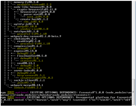
Once the command is executed successfully, you can see below output screen.
Step 2: Create project through Angular2 CLI
Run the following command to create Angular2 CLI project.
1 |
ng create angular2withsemantic |
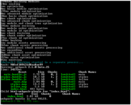
Once the command is successfully executed, you can see below output screen.
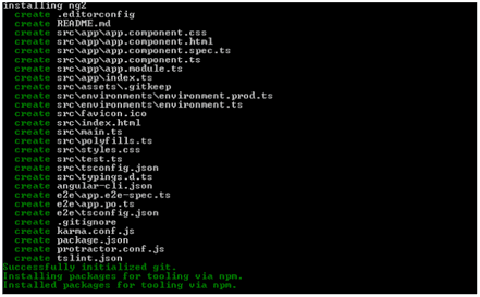
Step 3: Start Angular2 Project
Run the following command to start Angular2 CLI Project.
1 |
ng serve |
Once the command is successfully executed, you can see below output screen.
Step 4: Access application

Step 5: Integrate Semantic UI
We can integrate Semantic UI in two ways.
Approach 1
If you want to use Semantic UI as a dependency and just want to use the semantic default theme, use lighter semantic-ui-css.
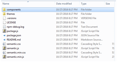
- Download semantic-ui-css, you can see below output screen ( after unzipping the file ).
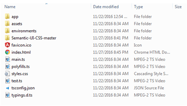
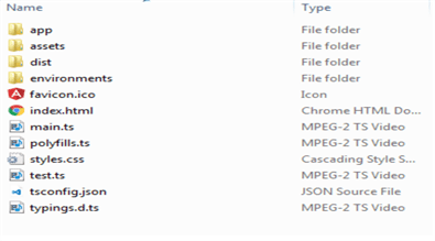
- Add this folder to your project, now, your project structure will be like this.
- Update your project index.html to refer semantic.css and semantic.js files ( you can use minified files as well ).
1 2 3 4 5 6 7 8 9 10 11 12 13 14 15 |
<!doctype html> <html> <head> <meta charset="utf-8"> <title>Angular2withsemantic</title> <base href="/"> <meta name="viewport" content="width=device-width, initial-scale=1"> <link rel="icon" type="image/x-icon" href="favicon.ico"> </head> <body> <app-root>Loading...</app-root> <link rel="stylesheet" "type="text/css" href="Semantic-UI-CSS-master/semantic.min.css"> <span style="font-weight: 400;"><script type="text/javascript" src="Semantic-UI-CSS-master/semantic.min.js"></script> </body></span> <span style="font-weight: 400;"> </html></span> |
- Build simple semantic template (view), modify app.component.html to have semantic component cards with buttons (different colors).
1 2 3 4 5 6 7 8 9 10 11 12 13 14 15 16 17 18 19 20 21 22 23 24 25 26 27 28 29 30 31 32 33 34 35 |
<div class="ui cards"> <div class="card"> <div class="content"> <div class="header">Primary button card</div> <div class="description"> Requested Loan Type: <br/> Home Loan </div> </div> <div class="ui bottom attached primary button"> Primary <br/> Status: Inprogress </div> </div> <div class="card"> <div class="content"> <div class="header">Secondary button card</div> <div class="description"> Requested Loan Type: <br/> Personal Loan </div> </div> <div class="ui bottom attached secondary button"> Secondary <br/> Status: Approved </div> </div> <div class="card"> <div class="content"> <div class="header">Default button card</div> <div class="description"> Requested Loan Type: <br/> Car Loan </div> </div> <div class="ui bottom attached button"> Default <br/> Status: Draft </div> </div> </div> |
Note:
1) Here, we display three cards, each card associated with the button which has the corresponding color.
2) Card1 and card2 buttons have primary and secondary colors, where they got derived as part of the default theme.
- Refresh the application.
Approach 2
Install Semantic UI, to define your own theme around Semantic UI components.
- create new folder semantictheme, to avoid merging complete semantic code and node_modules with the angular2 project, and run below command.
1 |
npm install semantic-ui |
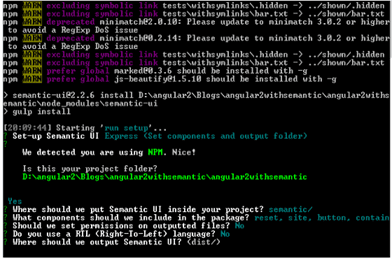
- It allows you to choose some options like below screen (refer more info here, http://semantic-ui.com/introduction/getting-started.html#install-semantic-ui)
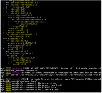
- Finally, you can see below screen.
- Once above two steps are completed, semantic folder looks like.
Here,
- tasks – supports gulp tasks, to clean and build semantic files and keep built files in dist folder.
- src
-
- themes – which has different folders, whereas each folder represents client’s theme.
- sites – here, you can override any theme variable (i.e. global variables).
- definitions – here, you can see CSS classes, which were written based on themes/sites and you can add custom CSS classes as well.
- theme.config – here, you can specify theme name about each component (i.e. you can configure different theme names about different components).
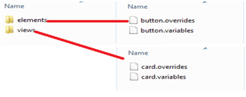
- Add new theme folder wtc in the themes folder. To change button and card colors, copy the below files from the default folder to wtc folder and keep them in the same structure.
- Modify themes/wtc/elements/button.variables to change primary and secondary colors.
1 2 3 4 5 6 7 8 |
/******************************* Button *******************************/ /*------------------- Element --------------------*/ @primaryColor: green; @secondaryColor: red; |
- Modify themes/wtc/views/card.variables to change card background color.
1 2 3 4 5 6 7 8 9 10 11 12 13 14 |
/******************************* Card *******************************/ /*------------------- View --------------------*/ /* Shadow */ @shadowDistance: 1px; @shadowBoxShadow: 0px @shadowDistance 3px 0px @solidBorderColor; /* Card */ @fontFamily: @pageFont; @display: flex; @background: orange; @borderRadius: @defaultBorderRadius; |
- Update themes/theme.config to refer wtc theme about button and card components.
1 2 3 4 5 6 7 8 9 10 11 12 13 14 15 |
/******************************* Theme Selection *******************************/ /* To override a theme for an individual element specify theme name below */ /* Global */ @site : 'default'; @reset : 'default'; /* Elements */ @button : 'wtc'; /* Views */ @ad : 'default'; @card : 'wtc'; |
- Run gulp build, it generates CSS and js files with latest changes and keeps them in dist folder.
- Make this dist folder available to the application, so copy this dist folder and keeps with project workspace.
- Update index.html to refer this latest dist(build) files.
1 2 3 4 5 6 7 8 9 10 11 12 13 14 15 |
<!doctype html> <html> <head> <meta charset="utf-8"> <title>Angular2withsemantic</title> <base href="/"> <meta name="viewport" content="width=device-width, initial-scale=1"> <link rel="icon" type="image/x-icon" href="favicon.ico"> </head> <body> <app-root>Loading...</app-root> <link rel="stylesheet" type="text/css" href="dist/semantic.min.css"> <script type="text/javascript" src="dist/semantic.min.js"></script> </body> </html> |
- Refresh application, we see reflected wtc theme changes here.

- Add one more new theme folder wtt in the themes folder and make the required files available like wtc theme folder.
- Modify themes/wtt/elements/button.variables to change primary and secondary colors.
1 2 3 4 5 6 7 8 |
/******************************* Button *******************************/ /*------------------- Element --------------------*/ @primaryColor: blue @secondaryColor: greenyellow; |
- Modify themes/wtt/views/card.variables to change card background color.
1 2 3 4 5 6 7 8 9 10 11 12 13 14 |
/******************************* Card *******************************/ /*------------------- View --------------------*/ /* Shadow */ @shadowDistance: 1px; @shadowBoxShadow: 0px @shadowDistance 3px 0px @solidBorderColor; /* Card */ @fontFamily: @pageFont; @display: flex; @background: yellow; @borderRadius: @defaultBorderRadius; |
- Update themes/theme.config to refer wtt theme about button and card components
1 2 3 4 5 6 7 8 9 10 11 12 13 14 |
/******************************* Theme Selection *******************************/ /* To override a theme for an individual element specify theme name below */ /* Global */ @site : 'default'; @reset : 'default'; /* Elements */ @button : 'wtt'; /* Views */ @ad : 'default'; @card : 'wtt'; |
- Do the gulp build, make the files available like wtc theme folder and refresh the application, we see reflected wtt theme changes here.
Summary
In this article, we learned how to incorporate semantic UI and theme with Angular 2. We found Semantic UI quite helpful and thought of sharing with you as well.
At WalkingTree we are very excited with possibilities that we see in Angular 2. We will be happy to connect with you and help you take advantage of this to build amazing web applications.

