Title: ExtJS Grid with header action
Summary: This article walks us through the steps to add the header action capability to the ExtJS GridPanel
Problem Statement: Many a times we need the capability on the ExtJS GridPanel where a user can see an action icon on the column header and on click of it the user can kick-off certain behavior in the system, as shown below. E.g. let us say, we have a grid where we are showing a list of parts and their prices. Now, some parts may be available but some may not. You want the user provide a filter icon on the Availability column so that when the user clicks on it, it will hide the parts which are not available, and clicking it again will show all the parts, again. Alternatively, you may want to provide a action on one of the columns to allow the user to add/remove all the items to their cart. There could be many practical needs where we may need a column header action functionality on the grid panel.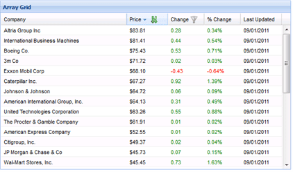
Prerequisites: Working knowledge of JavaScript, HTML, CSS, and ExtJS 3.x. Also, knowledge of how the Template/XTemplate work in ExtJS is required.
System Requirements: ExtJS 3.x, ExtJS 3.x compatible browser
Detail:
This is an overidden GridView plug-in to show the action icons in the column header and all the cells of a column. For the header action, this works on two column properties – enableHeaderAction and headerActionCls – to show the decide whether an action icon needs to be displayed or not and if it needs to be displayed, it uses the headerActionCls to show the icon.
When the user clicks on the action icon in the header, the plug-in fires – headeraction – event and passes the headeActionCls name to the handler so that that handler code can identify the icon which was clicked
Added the functionality to toggle the header action icons. This is driven by three additional properties
– toggleHeaderAction
– alternateHeaderActionCls
– alternateHeaderActionToolTip
This plug-in is compatible with the grid’s RowAction plug-in.
The implementation is based on overriding the GridView as shown below:
1 2 3 4 5 6 7 8 9 10 11 12 13 14 15 16 17 18 19 20 21 22 23 24 25 26 27 28 29 30 31 32 33 34 35 36 37 38 39 40 41 42 43 44 45 46 47 48 49 50 51 52 53 54 55 56 57 58 59 60 61 62 63 64 65 66 67 68 69 70 71 72 73 74 75 76 77 78 79 80 81 82 83 84 85 86 87 88 89 90 91 92 93 94 95 96 97 98 99 100 101 102 103 104 105 106 107 108 109 110 111 112 113 114 115 116 117 118 119 120 121 122 123 124 125 126 127 128 129 130 131 132 133 134 135 136 137 138 139 140 141 142 |
Ext.override(Ext.grid.GridView, { init : function(grid){ this.grid = grid; this.initTemplates(); this.initData(grid.store, grid.colModel); this.initUI(grid); //intercept the click and mousedown event on the grid grid.processEvent = grid.processEvent.createInterceptor(function(name, e) { if('click' === name) { var t = e.getTarget('.ux-header-action-item'); if (!Ext.isEmpty(t)) { var cls = t.className; cls = cls.split(" "); cls = cls[cls.length - 1]; //change the icon, if needed var headerIdx = this.findHeaderIndex(t); var column = this.cm.getColumnById(headerIdx); if (column.toggleHeaderAction || column.alternateHeaderActionCls || column.alternateHeaderActionToolTip) { var tmpNode = this.fly(t).removeClass(cls); var newCls = column.headerActionCls; var newQtip = column.headerActionToolTip; if (cls === column.headerActionCls) { newCls = column.alternateHeaderActionCls; newQtip = column.alternateHeaderActionToolTip; } tmpNode.addClass(newCls); tmpNode.set({qtip: newQtip}); } grid.fireEvent('headeraction', grid, cls, headerIdx, column); //return false so that the sorting does not start return false; } else { return true; } } }, this); }, initTemplates : function(){ var ts = this.templates || {}; if(!ts.master){ ts.master = new Ext.Template( '<div class="x-grid3" hidefocus="true">', '<div class="x-grid3-viewport">', '<div class="x-grid3-header"><div class="x-grid3-header-inner"><div class="x-grid3-header-offset" style="{ostyle}">{header}</div></div><div class="x-clear"></div></div>', '<div class="x-grid3-scroller"><div class="x-grid3-body" style="{bstyle}">{body}</div><a href="#" class="x-grid3-focus" tabIndex="-1"></a></div>', '</div>', '<div class="x-grid3-resize-marker"> </div>', '<div class="x-grid3-resize-proxy"> </div>', '</div>' ); } if(!ts.header){ ts.header = new Ext.Template( '<table border="0" cellspacing="0" cellpadding="0" style="{tstyle}">', '<thead><tr class="x-grid3-hd-row">{cells}</tr></thead>', '</table>' ); } if(!ts.hcell){ ts.hcell = new Ext.XTemplate( '<td class="x-grid3-hd x-grid3-cell x-grid3-td-{id} {css}" style="{style}"><div {tooltip} {attr} class="x-grid3-hd-inner x-grid3-hd-{id}" unselectable="on" style="{istyle}">', this.grid.enableHdMenu ? '<a class="x-grid3-hd-btn" href="#"></a>' : '', '{value}<img class="x-grid3-sort-icon" src="', Ext.BLANK_IMAGE_URL, '" /><tpl if="enableHeaderAction">{headerActionText}<img class="ux-header-action-item {headerActionCls}" src="', Ext.BLANK_IMAGE_URL, '" qtip="{headerActionToolTip}"/></tpl>', '</div></td>' ); } if(!ts.body){ ts.body = new Ext.Template('{rows}'); } if(!ts.row){ ts.row = new Ext.Template( '<div class="x-grid3-row {alt}" style="{tstyle}"><table class="x-grid3-row-table" border="0" cellspacing="0" cellpadding="0" style="{tstyle}">', '<tbody><tr>{cells}</tr>', (this.enableRowBody ? '<tr class="x-grid3-row-body-tr" style="{bodyStyle}"><td colspan="{cols}" class="x-grid3-body-cell" tabIndex="0" hidefocus="on"><div class="x-grid3-row-body">{body}</div></td></tr>' : ''), '</tbody></table></div>' ); } if(!ts.cell){ ts.cell = new Ext.XTemplate( '<td class="x-grid3-col x-grid3-cell x-grid3-td-{id} {css}" style="{style}" tabIndex="0" {cellAttr}>', '<div class="x-grid3-cell-inner x-grid3-col-{id}" unselectable="on" {attr}>{value}', '</div></td>' ); } for(var k in ts){ var t = ts[k]; if(t && Ext.isFunction(t.compile) && !t.compiled){ t.disableFormats = true; t.compile(); } } this.templates = ts; this.colRe = new RegExp('x-grid3-td-([^\\s]+)', ''); } ,renderHeaders : function() { var cm = this.cm, ts = this.templates, ct = ts.hcell, cb = [], p = {}, len = cm.getColumnCount(), last = len - 1; for (var i = 0; i < len; i++) { p.id = cm.getColumnId(i); p.value = cm.getColumnHeader(i) || ''; p.style = this.getColumnStyle(i, true); p.tooltip = this.getColumnTooltip(i); var col = cm.getColumnById(p.id); p.headerActionCls = col.headerActionCls; p.headerActionText = col.headerActionText; p.enableHeaderAction = col.enableHeaderAction; p.headerActionToolTip = col.headerActionToolTip; p.toggleHeaderAction = col.toggleHeaderAction; p.alternateHeaderActionCls = col.alternateHeaderActionCls; p.alternateHeaderActionToolTip = col.alternateHeaderActionToolTip; p.css = i === 0 ? 'x-grid3-cell-first ' : (i == last ? 'x-grid3-cell-last ' : ''); if (cm.config[i].align == 'right') { p.istyle = 'padding-right:16px'; } else { delete p.istyle; } cb[cb.length] = ct.apply(p); } return ts.header.apply({cells: cb.join(''), tstyle:'width:'+this.getTotalWidth()+';'}); } }); |
How it works:
Ext.grid.GridView is added to the GridPanel as a plugin, by default. It takes the complete responsibility of formatting the grid view and putting all the styles (e.g. apply different background for the alternate rows). In this solution, we have overridden the following methods of the base Ext.grid.GridView class:
1. init
2. initTemplates
3. renderHeaders
init is the main plug-in method which is called by the ExtJS framework to initialize a plug-in. We have modified this method to add the extra code to intercept the event to figure out whether the event has occurred on a header action. And, if so, it fires the headeraction event. While firing the event, we are passing the following to the event handler:
1. grid panel instance reference
2. CSS class name of the header action, which is clicked
3. column index
4. column object representing the column where the header action was clicked
In initTemplates, we have modified the hcell template where we have added the additional tags related to the header action, as shown below:
1 |
<tpl if="enableHeaderAction">{headerActionText}<img class="ux-header-action-item {headerActionCls}" src="', Ext.BLANK_IMAGE_URL, '" qtip="{headerActionToolTip}"/></tpl>', |
Here, we are adding an <img> tag if on the incoming column information, enableHeaderAction flag is true. headerActionText property on the column is set as the alternate text for the image whereas headerActionCls contains the style name, which has the image path in it. Additionally, headerActionToolTip property is used to show the tooltip for the corresponding header action icon.
Now that we have added the element to the tag, which can be rendered based on the properties value on a column, and also we have written the code in the init method to handle the click events on the header action, it is time to make the changes, which are required to pass the header action related properties to the grid view so that it can apply them on the modified hcell template to render the header action icon on a grid panel. To accomplish this, we modified renderHeaders method, where we are setting the properties on p, as shown below:
1 2 3 4 5 6 7 |
p.headerActionCls = col.headerActionCls; p.headerActionText = col.headerActionText; p.enableHeaderAction = col.enableHeaderAction; p.headerActionToolTip = col.headerActionToolTip; p.toggleHeaderAction = col.toggleHeaderAction; p.alternateHeaderActionCls = col.alternateHeaderActionCls; p.alternateHeaderActionToolTip = col.alternateHeaderActionToolTip; |
After the above code is executed, the additional header action related properties are set on the internal column object and will now be available to the hcell template and will show the icon that we would have specified as part of the headerActionCls.
After adding this override, now here is a sample usage of the properties showing how these properties can be specified to get the icons appearing on the header:
1 2 3 4 5 6 7 8 9 10 11 12 13 14 15 16 17 |
columns: [ { header : Messages.ITEM_DESC width : 350, renderer : itmeDescRenderer, dataIndex: 'Description', enableHeaderAction : true, headerActionCls: 'allitem-icon', headerActionToolTip: 'Add all item', toggleHeaderAction: true, stripeRows: true, alternateHeaderActionCls: 'remove-allitem-icon', alternateHeaderActionToolTip: 'Remove all items', .... }, { ... }] |
And, following code shows, how we can register our handler on the GridPanel for the headeraction event:
1 2 3 4 5 6 7 8 9 10 |
headeraction : function(grid, actionCls, headerIdx, column) { if(actionCls === 'allitem-icon') { var records = grid.getStore().getRange(); .... } if(actionCls === 'remove-allitem-icon') { ..... } } |
And, if we look at the CSS, following shall be the CSS defined, which we have used to set the values for headerActionCls property:
1 2 3 4 5 6 7 |
.allitem-icon { background: url(../images/add.png) no-repeat 0 0 !important; } .remove-allitem-icon { background: url(../images/delete.png) no-repeat 0 0 !important; } |
Following is a sample screen showing how the header actions will appear on the screen:

If you are reading this, I hope this article was useful to you and look forward to your feedback!