Overview
Creating themes using CSS is awesome, but its complex syntax makes life difficult. As project grows and demands more and more styling consumes lot of time in organizing it perfectly.
To over come all these, as part of this article we will see how Sass and Compass will help in creating the themes easily and use it in your application.
Problem Statement
Most of the application needs an custom theme to give an unique look and feel for application, so in order to create an custom theme we will see following items as part of this article
- Tools required
- Installation of tools
- Understanding the files/folders structure for ExtJS theme
- Overriding styles for existing ExtJS components
- Defining ui and using on a component
- Theme for ExtJS charts
Pre-requisites
Following are the various tools required and find the respective links for installation
- Make sure that you have SenchaCmd-3.1.2 installed, for how you can refer link
- Sencha ExtJS app created with SenchaCmd ( Sencha ExtJS SDK 4.2.X )
- Ruby,Gem installed, for how you can refere link
- Working knowledge of ExtJS
Details
Installation of tools
Step 1: Install compass on your machine
For linux : Open the terminal and run following command, with super user permissions
gem install compass
After successful installation of compass you will see following message,
Successfully installed compass-0.12.2
Parsing documentation for compass-0.12.2
Done installing documentation for compass (3 sec).
1 gem installed
Step 2: Install CSS parser
To view the output statistics of your Sass stylesheet, let us install CSS parser.
One your terminal and type following command with super user permissions,
gem install css_parser
After succssful installation of css_parser you will see following message,
Fetching: addressable-2.3.4.gem (100%)
Successfully installed addressable-2.3.4
Fetching: css_parser-1.3.4.gem (100%)
Successfully installed css_parser-1.3.4
Parsing documentation for addressable-2.3.4
Installing ri documentation for addressable-2.3.4
Parsing documentation for css_parser-1.3.4
Installing ri documentation for css_parser-1.3.4
Done installing documentation for addressable, css_parser (2 sec).
2 gems installed
Step 3: You should have Sencha ExtJS sample app created with Sencha Cmd, if no execute the following command to create Sencha ExtJS app
- Open the terminal and execute the following command
sencha -sdk <path to sencha ExtJS sdk> generate app <app-name> ./<app-name>
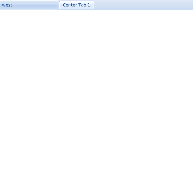
Above command will create an sample ExtJS application, move this app to web server to access through browser, which will show the following view
Understanding the files/folders structure for ExtJS theme
To create an new custom theme, navigate to your project and generate theme easily using Sencha CMD as below
sencha generate theme <theme-name>
Ex: sencha generate theme wtc
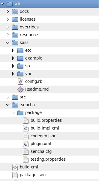
Above command generate the following files and folders under <project-dir>/packages/ directory
- sass/etc – Here goes the code that does not relate directly to JavaScript classes
- sass/var – Variable definations i.e. in order of JavaScript class hierarchy
- sass/src – Mixins and rules i.e. in order of JavaScript class hierarchy
Overriding the styles of existing component
- body background color
- CSS property : background-color
- Variable : $panel-border-radius
- border radius
- CSS property : border-radius
- Variable : $panel-border-radius
- header text color
- CSS property : color
- Variable : $panel-header-color
- header text font size
- CSS property : font-size
- Variable : $panel-header-font-size
Add values to above variables and put into the /wtc/sass/etc/all.scss file as below
1 2 3 4 5 |
$base-color: #aa0000; $panel-body-background-color:#363333; $panel-border-radius:4px; $panel-header-color:#ffffff; $panel-header-font-size:14px; |
Step 2: Open the terminal and navigate to project directory and run the following command,
sencha app build
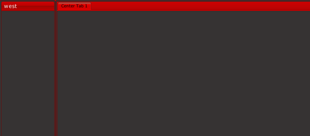
Now refresh the browser you will see the following changes
Defining ui and using on a component
In order to give an different and unique appearance for components ExtJS provides the feature to configure component specific ui by default every component has default ui.
Example : Let us consider that in your application you want to identify the panels based on the modules, so you can create an module specific ui and use it for respective panels.
In this article you will see how we can create our own custom ui for ExtJS panel and use it with component.
Step 1: To create an ui for Panel component, create following directories and files,
Directory :
<project-directory>/packages/wtc/sass/src/panel
File:
<project-directory>/packages/wtc/sass/src/panel/Panel.scss
Step 2: Now you need to override the your custom values for panel ui in Panel.scss, for this ExtJS provides extjs-panel-ui mixin
Copy following content to Panel.scss file for extjs-panel-ui mixin,
1 2 3 4 5 6 7 8 9 10 11 12 13 14 15 16 17 18 19 20 21 22 23 24 25 26 27 28 29 30 31 32 33 34 35 36 37 38 39 40 41 42 43 |
@include extjs-panel-ui( $ui-label:'wtcpanel', $ui-border-color:#000000, $ui-header-color:#000000, $ui-header-background-color:#A7CE41, $ui-body-background-color:#FFFFDD, $ui-border-radius:$panel-border-radius, $ui-border-width:$panel-border-width, $ui-header-font-family:$panel-header-font-family, $ui-header-font-size:$panel-header-font-size, $ui-header-font-weight:$panel-header-font-weight, $ui-header-line-height:$panel-header-line-height, $ui-header-border-color:$panel-header-border-color, $ui-header-border-width:$panel-header-border-width, $ui-header-border-style:$panel-header-border-style, $ui-header-inner-border-color:$panel-header-inner-border-color, $ui-header-inner-border-width:$panel-header-inner-border-width, $ui-header-text-padding:$panel-header-text-padding, $ui-header-text-transform:$panel-header-text-transform, $ui-header-padding:$panel-header-padding, $ui-header-icon-width:$panel-header-icon-width, $ui-header-icon-height:$panel-header-icon-height, $ui-header-icon-spacing:$panel-header-icon-spacing, $ui-header-icon-background-position:$panel-header-icon-background-position, $ui-header-glyph-color:$panel-header-glyph-color, $ui-header-glyph-opacity:$panel-header-glyph-opacity, $ui-tool-spacing:$panel-tool-spacing, $ui-tool-background-image:$panel-tool-background-image, $ui-body-color:$panel-body-color, $ui-body-border-color:$panel-body-border-color, $ui-body-border-width:$panel-body-border-width, $ui-body-border-style:$panel-body-border-style, $ui-body-font-size:$panel-body-font-size, $ui-body-font-weight:$panel-body-font-weight, $ui-background-stretch-top:$panel-background-stretch-top, $ui-background-stretch-bottom:$panel-background-stretch-bottom, $ui-background-stretch-right:$panel-background-stretch-right, $ui-background-stretch-left:$panel-background-stretch-left, $ui-include-border-management-rules:$panel-include-border-management-rules, $ui-wrap-border-color:$panel-wrap-border-color, $ui-wrap-border-width:$panel-wrap-border-width ); |
For your mixin you need provide an label which will be used later with component using $ui-label property. Also as part of this article you will see the basic property changes for the panel which as shown below, if you need more customization you can change respective properties in mixin
$ui-border-color, $ui-header-color, $ui-header-background-color, $ui-body-background-color.
Step 3: Now open the terminal and navigate up to project directory and execute following command which will build your app and picks up the custom ui changes you made
sencha app build
If this command executes successfully then you are done with custom ui for ExtJS panel component
Step 4: Now use your custom ui i.e. wtcpanel with panel component as below
Add one more panel to the view Main.js as shown below
1 2 3 4 5 6 7 8 9 10 11 12 13 14 15 16 17 18 19 20 21 22 23 24 25 26 27 28 29 |
Ext.define('empower.view.Main', { extend: 'Ext.container.Container', requires:[ 'Ext.tab.Panel', 'Ext.layout.container.Border' ], xtype: 'app-main', layout: { type: 'border' }, items: [{ region: 'west', xtype: 'panel', title: 'west', width: 150 },{ region: 'west', xtype: 'panel', title: 'WTC Panel', width: 150 },{ region: 'center', xtype: 'tabpanel', items:[{ title: 'Center Tab 1' }] }] }); |
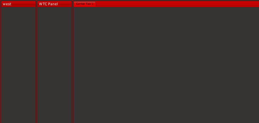
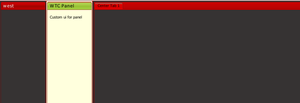
Now refresh the browser you will see the new panel which you added above
But if you see in above image you will not see the custom ui changes for any of the panel. Now in order to use wtcpanel ui with your panel you need to add property ui to your panel as shown below
1 2 3 4 5 6 7 8 |
{ region: 'west', xtype: 'panel', title: 'WTC Panel', ui:'wtcpanel', html:'<BR>  Custom ui for panel', width: 150 } |
Now refresh the browser you will see the following output
Theme for ExtJS Charts
Always default theme will not be sufficient for ExtJS charts, so will might want to change the theme , colors for charts in ExtJS.
ExtJS currently supports seven default themes which are : Base, Green, Sky, Red, Purple, Blue and Yellow.
As part of this article you will see how we can create custom themes for ExtJS charts. Follow below steps for this
Step 1: First up all create an sample pie chart using following code, copy paste below code in view Main.js
1 2 3 4 5 6 7 8 9 10 11 12 13 14 15 16 17 18 19 20 21 22 23 24 25 26 27 28 29 30 31 32 33 34 35 36 37 38 39 40 41 42 43 44 45 46 47 48 49 50 51 52 53 54 55 56 57 58 59 60 61 62 63 64 65 66 67 68 69 70 71 72 |
Ext.define('empower.view.Main', { extend: 'Ext.container.Container', requires:[ 'Ext.tab.Panel', 'Ext.layout.container.Border', 'Ext.chart.Chart', 'Ext.chart.series.Pie' ], xtype: 'app-main', layout: { type: 'border' }, config:{ items: [{ region: 'west', xtype: 'panel', title: 'west', width: 150 },{ region: 'west', xtype: 'panel', title: 'WTC Panel', ui:'wtcpanel', html:'<BR>  Custom ui for panel', width: 150 },{ region: 'center', xtype: 'panel', title: 'Pie Chart', items:[{ xtype: 'chart' , width: 400, animate: true, shadow:true, height: 300, legend: { position: 'right' }, theme:'Base:gradients', store:{ fields:[ {name: 'sliceName', type: 'string'}, {name: 'slicevalue', type: 'int'} ], data: [ {sliceName:"Slice 1",slicevalue:25}, {sliceName:"Slice 2",slicevalue:50}, {sliceName:"Slice 3",slicevalue:75}, {sliceName:"Slice 4",slicevalue:75}, {sliceName:"Slice 5",slicevalue:75} ] }, series: [ { type: 'pie', field: 'slicevalue', showInLegend: true, label: { field: 'sliceName', contrast: true }, highlight: { segment: { margin: 20 } }, }] }], renderTo:Ext.getBody() }] } }); |
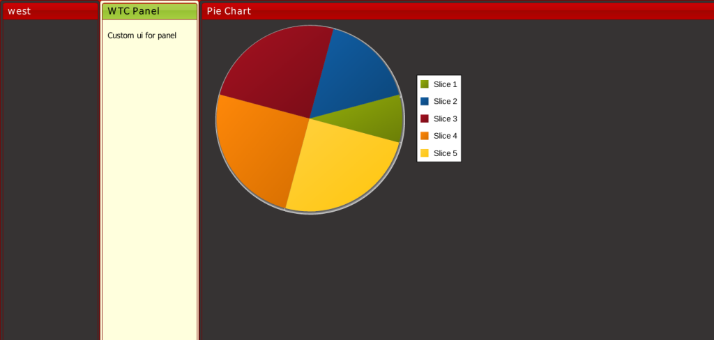
Refresh the browser you will see following result
Step 2: Now let us override the base theme for charts and create an custom theme for charts,
As part of this article we will cover how to override the base colors with custom colors and use them with above pie chart example.
Follwoing code overrides the Ext.chart.theme.Base and overrides the default colors. Copy following code and past at the end of view Main.js
1 2 3 4 5 6 7 8 9 10 11 12 13 14 |
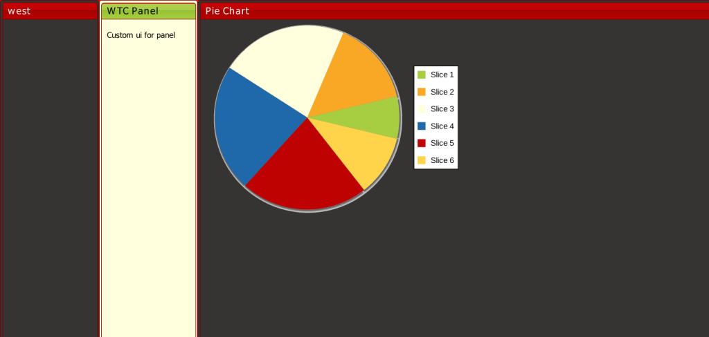
Ext.chart.theme.WtcChartTheme = Ext.extend(Ext.chart.theme.Base, { constructor: function(config) { //Ext.chart.theme.Base.prototype.constructor.call(this, Ext.apply({ this.callParent([Ext.apply({ colors: ['#A7CE41', '#F9A826', '#FFFFDD', '#1F68AA' , '#BE0202', '#FFD44B' ] }, config)]) } }); |
Now replace the theme property value from Base:gradients to WtcChartTheme in code shown in step 1, now refresh the browser you will see the pie chart colors are changed with custom colors.
Similarly we can override the different properties of default theme like
- font style , fill color for axisTitle for line , Bar charts
- Series theme for Bar,Pie charts
- marker themes for Radar,Line etc
Conclusion
In this article we saw that how we provide the custom look and feel for the application using Sass and Sencha Cmd. We covered file structure for ExtJS theme, creating custom themes and using with ExtJS application, how to override the default styles for components , definging custom ui and using it with components and custom theme for charts etc.
