A Search Bar is a blessing on any interface to quickly get you what you’re looking for. But, it is not as easy as it sounds while you design your interface, for it needs some strategic planning. For starters, put the search box where end users expect to find it.
It is always a riddling experience for most designers when it comes to planning the placement and usability of Search Bars. Some of the basic questions that designers need to consider are:
- WHAT search should it do?
- WHERE should it be placed on the user interface?
- HOW should it behave or respond to user input or search patterns?
This Blog helps find answers to these imperative questions and recommends some best practices in using Search Bars.
WHAT SEARCH SHOULD IT DO?
Remember, interacting with a search bar is like having a conversation with it.
Most of us think that If the users frame the search string right, they get what they are looking for. But, is that the right way of perceiving it?
Personally, I would not agree because here we have the search function that has evolved over the years from just showing results that correspond to the questions framed to identifying and understanding a pattern in the search string and reframing your query or search input to show the closest result(s).
Talking about Patterns, these are user behaviours that depict how the user interacts with a search field, and how he/she frames his/her question/search query, what results does he/she seek, and what next steps would he/she act upon.
Search Patterns are really important when it comes to what and how many results we want to display.
A book by Peter Morville & Jeffery Callender named “Search Patterns” enumerates the following aspects.
Quit pattern. A user types a query > sees results > quits.
Narrow pattern. A user types a query > sees results > narrows them down.
Best first pattern. A user types a query > sees results > opens one of the first links that is the best match to the results he/she is looking for.
Pearl growing pattern. A user types a query > opens one of the results> opens related links inside the document or uses terms from the document for queries.
Do visit our services page on Product Design to learn about our offerings in designing Search Fields using these aspects.
WHERE Should It be Placed on the User Interface?
For designers who just follow the crowd, you would get your answer instantly if you follow some of the popular websites such as Amazon, YOUTUBE where the Search Bar is placed at the top center or top right corner of the page. By doing so, you’ve got it right where it should be if you want to consider only its conventionality when it comes to usage.
For those who like to question the norms and do things differently, this is what you can follow,
Display the Search Field Prominently
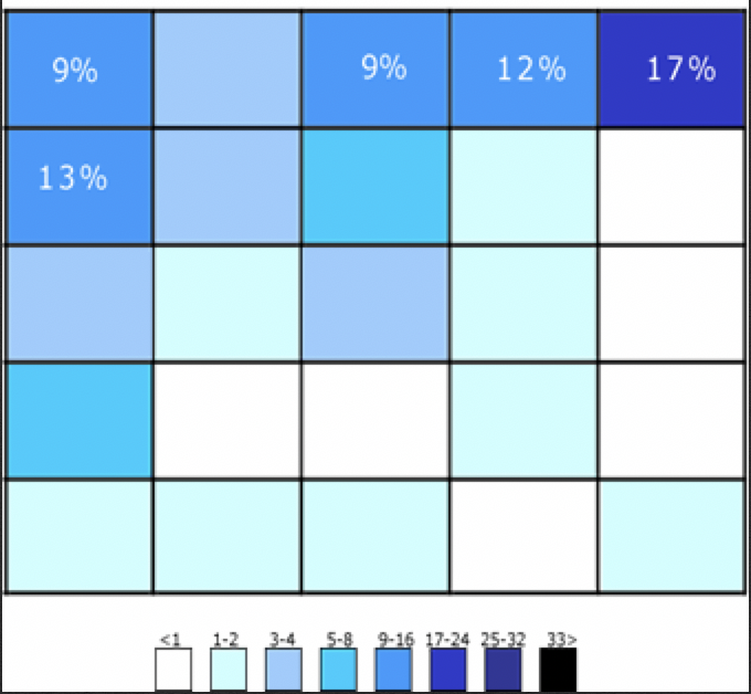
Well, A. Dawn Shaikh and Keisi Lenz created a chart showing the expected position of the Search Field. According to a survey that they conducted with 142 participants, the study found that the most convenient spot for users would be the top right or top left of every page on your site, where users could easily find it using the common F-shaped scanning pattern depicted below.
Now, for the designers who want to stand out and challenge others, we’d say that the sky’s the limit.
You will need to prove that your way is better than any other.
HOW Should it Behave or Respond to User Input or Search Patterns?
Auto-suggestion mechanisms help users find the most fitting query by trying to predict it based on the characters entered by them.
In 2008, Google searches implemented the auto-suggestion pattern to its search mechanisms. Sometimes, users search the same thing or something similar more than just once.
By remembering the search history on the browser, Google saves time and creates a good user experience through predictive results.
As a result, the search fields today are equipped with auto-suggestion and auto-completion patterns. In fact, this has become a thumb rule in search field design today.
Casual users are very poor at query formulations. If they don’t get good results in their first try then their successive search attempts rarely succeed.
In fact, this has led them to give up more often than never.
When autocomplete suggestions work well they help the user articulate better search queries.
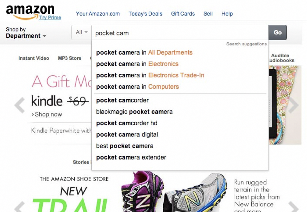
Let us take the Amazon Search Component for example as depicted below to delineate the best practices in designing search
Here, the designer always ensures that the input field is accommodative enough for users to type in long queries. Your next question would be what purpose does the dynamic field serve if the users have to perform the heavy-duty task of typing long queries.
Well, if only a portion of the text is visible at a time, then it means bad usability since users cannot review and edit the search text easily. In fact, when the search box has a limited number of visible characters, users are forced to use short, imprecise queries since longer queries would be hard and inconvenient to read through the entire length of it.
If input fields are sized according to their expected length, they are both easier to read and interpret for users.
Finally, the “best practice” is to have a standard 27 characters-long text input box with the autocomplete feature and usage patterns even for fairly unique site designs.
Conclusion
Good Search is Good UX. Users expect smooth experiences when searching and they typically make quick judgments with respect to results. However, technical constraints will always play a big role in design. Which is why involving a development team from the research phase itself, is important. The team will understand user needs and help find the optimal solution.
P.S. We’re offering a free UX audit (until we have our hands full!) to understand, plan and optimize the user journey which starts by evaluating the design, interaction and emotion, of your product or website. Register here and we’ll get in touch soon!


