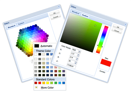
Sencha ExtJS provides a basic colour picker, which allows the user to choose a colour from a pre-defined set of colours. Many enterprises desire a more advanced colour picker as compared to what is available out-of-the-box. And, the one, which is very famous is the one that comes along with Microsoft Office. This article talks about an ExtJS extension, which provides the features that are available with the MS Office colour picker.
The extension has been developed using Sencha ExtJS 4.2 and, upon request, it can be made available for the older versions of the framework.
From where to get?
The extension is available on Walking Tree eStore for purchase and download. The downloaded package would contain the following:
- Minified version of the component
- Complete well-formatted component code
- Sample to demonstrate the usage and functionalities of the component
- Documentation describing the classes, configs, properties, methods, and events
Features
The extension has been implemented as a custom ExtJS component. The component extends the standard colour picker component and provides various options to choose the desired colour. User can choose colour from a wide variety of options:
- A pre-defined theme of colours
- A pre-defined standard colours
- Custom colours from a colour map
- Custom colours from a colour spectrum
The component, also, provides the mechanism to define the default colour and the same can be applied in case the user wants to reset their colour choices and want to go back to the default colour.
It provides, both RGB as well as HEX colour code to build application logic.
Let us review the different ways a user can choose the colour of their choice.
Pre-defined theme of colours
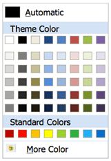
The component provides a pre-defined theme of colours, as shown below. A user can select a colour by clicking on it.
Pre-defined Standard colours
For quick selection, the component also shows a series of standard colours for selection, as shown below.
Custom colours from a colour map
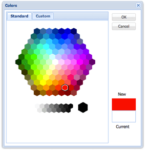
In case the theme colours and the standard colours do not suffice, user can click on More Color to bring up the colour map to choose their colour from, as shown below. User has to click on the OK button to complete their colour selection.
Custom colours from a colour spectrum
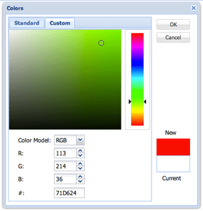
For more choice, there is a custom tab, which shows a colour spectrum for colour selection, as shown below. Again, the user has to click on the OK button to complete their colour selection.
Using it in your application
The component extends the base Ext.picker.Color class. So, the usage is very similar to the way we use the Ext.picker.Color class. Here is the code to instantiate the new colour picker:
1 2 3 4 5 6 7 8 9 |
var colPicker = Ext.create('Wtc.ux.component.ColorPicker', { ,height: 250 ,renderTo: Ext.getBody(), ,listeners: { select: function(picker, selColor) { alert('You have selected color - '+ selColor); } } }); |
And, here is the snippet using the xtype:
1 2 3 4 5 6 7 8 9 10 11 |
.... items: [{ xtype: 'wtccolorpicker' ,height: 250 ,listeners: { select: function(picker, selColor) { alert('You have selected color - '+ selColor); } } }] .... |
This is it. Feel free to write to us on sales@walkingtree.in for any question related to this extension. At Walking Tree we practice and recommend Sencha Products like ExtJS and Sencha Touch to build amazing web / touch apps. In case you are looking for training or professional assistance, contact us by visiting our website.
Resources
http://docs.sencha.com/extjs/4.2.2/#!/api/Ext.picker.Color
http://www.w3schools.com/tags/ref_colorpicker.asp
http://dhtmlx.com/docs/products/dhtmlxColorPicker/
http://bgrins.github.io/spectrum/


