
Blogs
Healthcare UX – Where Design Can Save Lives

The need for improvement in healthcare UX has become apparent over the years. According to a John Hopkins study, nearly 250,000 people die in the US every year due to medical errors. There are many factors that can cause these errors, however, well designed UX can play a key role in solving them.
What’s at stake?
Poor usability and UX have led to life-threatening errors. For example, during the peak of the Ebola outbreak, a man getting a checkup after returning to the US from a visit to West Africa was mistakenly sent home (report) because of ‘bad software’. Such reports give further clarity on the need for improvement in healthcare UX.
Issues with alignment
The fact is that every sector, from hospital administration to health care processes, needs revamping. With such a need, it would be easy to presume that the healthcare industry is working tirelessly to hire the best UX designers out there. Unfortunately, this isn’t the case.
The sobering truth is that while healthcare technology is improving by leaps and bounds, industry professionals still use confusing and disorganized systems. Hospital administration portals still present information in volumes that can feel like walking into a minefield – one wrong step and it could all blow up.

A single patient page can display information on the reasons, dates, actions, and status of the visit, personal information, images, and so much more, all in one place. Healthcare professionals are subject to long hours of strenuous work resulting in fatigue. In such a state, mistakes can happen.
Dangers of poor diagnosis
Doctors are heavily dependent on patient data and hence hospital administration is heavily dependent on good software. Administrators need to store data on every patient – their health record, medical record, personal health record, care record, etc.

Further, each department in a hospital will have its unique requirements. This means storing information on various processes and systems. By extension, this will also include unique and multiple reports from each department. Furthermore, across all the departments and the various reports and processes they have, there may arise a need to share information.
New employees will need training on matters of administration to manage all scenarios. With so many things happening seemingly in tandem, a single mistake can be disastrous. A poor UX design can increase the chances of this happening. So, how can we address these matters of concern?
Simplicity over quantity
It is important to remember that healthcare professions work in an industry where there are lives at stake. An effective, well thought-out UX will empower them to do their jobs with efficiency.
Hence, UX designers must first familiarize themselves with the healthcare industry’s work standards for their designs to be effective. This would mean doing research on all aspects of the industry and then adhering to them. This will make the designs familiar to the user and thus reduce the risk of errors.
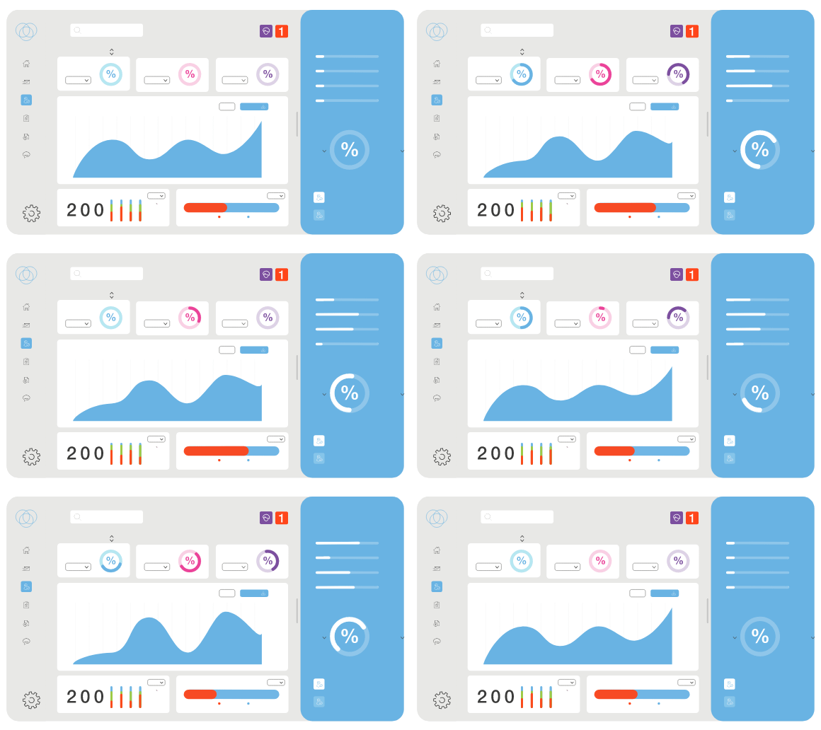
As a rule of thumb, UX designers should perfect simplicity over quantity – especially when designing for the healthcare industry. The more simple and intuitive the design, the more effective its application. Occasionally, designers can tend to over-design by adding features that may improve things aesthetically, but add no value in terms of use. Hence, it is important to analyze your designs and ask if the elements/features you’ve added really need to be there. If your answer to that question is no, then it’s best to avoid them.
Here are a few other concepts that you can keep in mind while designing for healthcare.
Testing and fail-proofing your designs

Testing and fail-proofing are best done early. So, ensure this happens during the initial stages of your design. Develop your ideas into a simple model and put it out as early access for a small crowd. Such kind of testing, prototyping can help you validate your ideas and increase development speed. This will also help you refine your design concepts and ensure your final design is up to the mark.
Prioritize valuable information and efficient design
Adding irrelevant data and tabs, creating designs using high-contrast colors can be extremely distracting. Prioritizing the right information for a specific scenario will double up productivity and reduce the time spent in searching for information. Avoiding high-contrast colors will keep from distracting the user. Instead, designers can use colors as guides directing the users, in this case, the healthcare professionals, to the exact information they need. Hence, keeping your designs minimalistic is the goal of the day.
Easy access to information
Simplistic and minimalistic designs will help reduce the time it takes to find information. As opposed to opening or having to go through a plethora of tabs, quick access to valuable information can help save lives. Such a design will help doctors seamlessly find patient information, and can also help administrators send information faster.
Quick Checklist
While designing for Doctors
- Base your UI customization on specialty
- Use image recognition for easy data entry
- Provide multi-device support
- Ensure real-time sync across all devices
While designing for Patients
- Create personalized dashboards
- Maintain visual hierarchy
- Show the latest information
- Include a quick help guide for support
While designing for Pharmacists
- Provide a customizable action panel
- Ensure emphasis on key aspects through minimal design
- Show real-time inventory graphs
- Provide multi-branch support
Compliment the checklist with a strategy

The above checklist has suggestions that you can use to improve your UX design for the healthcare industry. However, having a strategy will ensure long-term success. Since the healthcare industry is fast-changing, your strategy can include keeping tabs on current events. Such information will help you create designs that are adaptive.
The healthcare industry is in dire need of designs that are collaborative, interactive, and patient-centric. These designs, while not eliminating all issues in healthcare, will reduce the risks of mistakes and hence, is a step in the right direction.
Would you like to know more about UX design principles, checklists, and strategies to help you create effective designs?
Our webinar on Applications of UX design in Healthcare has all the information you need!


