

Blogs
5 aspects you need to know about the dashboard and the end-user

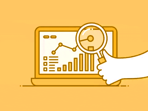
It is frustrating to not have the information you need at your fingertips. With astronomical data coming in from multiple sources, teams can find it challenging to pull relevant data. Additionally, this task can be tedious and suboptimal. The key to fixing this? – Dashboards.
You may ask; what is the most effective way of building a dashboard? What information should I keep, what should I not? What graphs or other graphical representations can I use to showcase this data?
These are valid concerns. I’d like to share some best practices that I have learnt over the years. In this blog I will share points you should consider, about the dashboard and the end-user, before you start your dashboard design. And next week, I will elaborate on design and layout principles.
So, let’s get started!
1. Consider your audience

The idea of creating a dashboard is to present data clearly and understandably – one that facilitates decision-making in your audience. Therefore, the context of use, the time, the device, all these factors come into play while designing an effective dashboard for your audience – these will determine the shape it will take.
Designs will naturally change depending on who is using the dashboard. For example, the requirements of an international client vs one close to home will be different. Another thing to consider while designing a dashboard, keeping your audience in mind, is simplicity.
Making dashboards complex by using confusing charts will result in users spending more time trying to understand the data and lose focus on other important things. The idea of having graphs to present data is to add value to the information showcased on the dashboard.
So, ask yourself, how would my audience like to see this information presented? Once you’ve answered that question, you can be sure your dashboards will look much better.
2. Choose relevant KPIs

It is important to select KPIs relevant to the industry you are in. Since your goals and requirements will be specific to that industry, doing your research is important. Once you have outlined your objectives and the goals you wish to set, you can identify relevant KPIs that will empower all your endeavors.
For example, if you are into the finance industry, some relevant KPIs would be; Operating Profit Margin, Operating Expense Ratio, Return on Equity, and The Berry Ratio. The goal is to present data in quantifiable measures that can be used to make informed decisions.
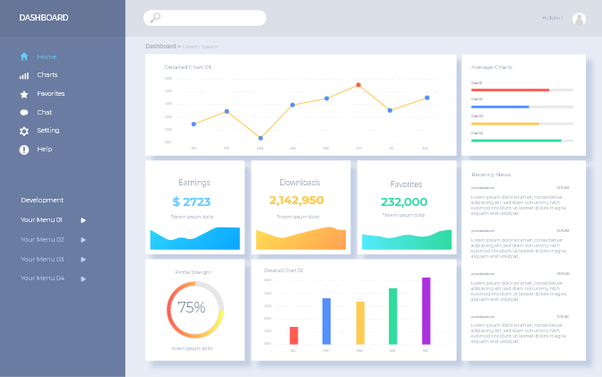
3. Select the right type of dashboard
Selecting the right type of dashboard is important as the purpose of a dashboard is to drive action. To do that, the information presented must be legible, and relevant to its viewer. Hence conveying the right sets of data to the right people is key. Hence, the question that needs to be asked is; what type of dashboard must you use?
Yes, type – there are different types of dashboards, each with its specific purpose. Consider three – strategic, operational, and analytical.
Strategic Dashboard
This is mainly used by the management as it helps monitor a company’s long-term strategies. Management can use it to measure performance metrics against strategic goals, reduce the time taken to meet performance indicators, and reduce operational costs.
Operational Dashboard
As the name suggests, this type of dashboard measures the performance of various operational processes.
It is perhaps the most common type of dashboard and is predominantly used to monitor and analyze a company’s activity in its area of operation. This dashboard alerts companies on business exceptions that are based on real-time data.
Analytical Dashboard
This dashboard is mainly used by analysts and contains large quantities of data. The goal of having an analytical dashboard is to make the best use of the historical data it gathers. Analytical teams can use this data to understand their customers, identify trends, and then use this data to create strategies that will benefit the company.
4. Choose the right type of chart
Charts convey all the statistical information on your dashboard. Hence, choosing the right chart type is of paramount importance, because the wrong one will mean the information you present is poorly conveyed. Poorly conveyed information can result in teams failing to perform at the top level.
So, to understand which chart to use, it is important to understand the purpose of the various charts available.
Number Chart
A number chart’s purpose is very straightforward – it gives you a quick overview of a KPI’s performance. It gives the total of any value assigned to it. For example, sales, visitors, percentage of evolution, etc.
Line Chart
Line charts are used to identify the volatility of trends – their accelerations or decelerations. Organizations can use this chart to show the changes of data over time, and the reason for these changes.
Bar Graphs
Horizontal bar graphs are great to make comparisons. For example, if you want to showcase a top 5 list of things, a bar graph would be perfect. Column bar graphs are used to show chronological data, while stacked charts are used to show part-to-whole relationships.
5. Offer a complete picture
Dashboards need to be specific and straight to the point. That means that they need to offer the complete picture without having too much clutter. The idea is to put in information that is relevant and conveys the right idea. This would mean resisting the urge to put in all available information and understand what fits best.
The information being presented should be precise and convey a holistic story. To be able to achieve this, first understand the information that needs to be presented. This would require that you research the data insights, ask relevant questions to understand exactly what needs to be highlighted, and then set the plan to present your story.
Understand who the information is for and work at breaking the information down into sizable bits. Adding charts and graphs to convey your information and make it appear more spread out. Use recognizable figures – this will save time. Lastly present your information in proper order, with appropriate highlights.
Keeping these points in mind will lay a solid groundwork for your dashboard designs – as it did mine. In the next part of this two part series, I will talk about how you can choose the right layout, what colours to pick, and why simplicity is important.
P.S. I will be conducting a webinar on the 17th of June, on optimizing dashboards. We will also have a live Q&A session where we can continue our discussion. Watch Webinar.