


Blogs
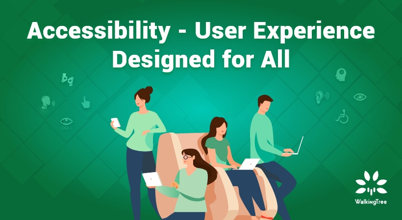
Accessibility – User Experience Designed for All
Accessibility put simply, is a user experience designed for all. This concept, although around for a while, has gained traction only recently. However, you may argue that user experience is already being designed for everyone; after all, it is called user experience. While that is true, the “designed for all” statement takes into consideration the wide demographic of users – this includes those with disabilities.
Naturally, the question that follows will be – how can you make your designs accessible to those with disabilities, along with everyone else? If you are thinking about this, then don’t get overwhelmed.
The fact is, that it is possible and many are already doing it – the iOS 14 is perhaps the best example of this. This advancement shows how accessibility benefits from technologies like voice over AI, greatly enhancing the user experience for people with disabilities. This has greatly enhanced its accessibility. Further, I want you to rest assured that accessibility in design isn’t as hard as you may think.
Accessibility Breeds Innovation
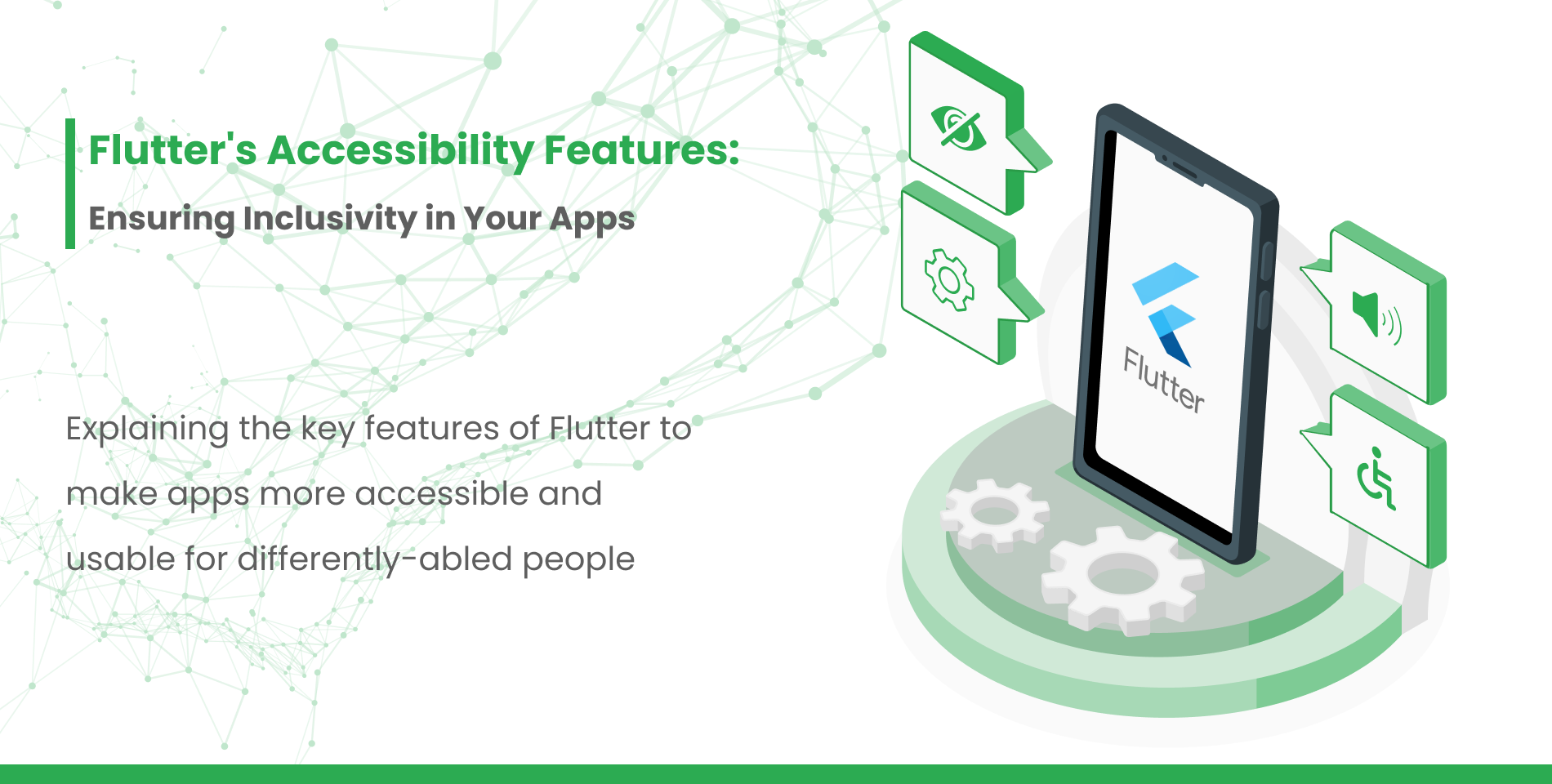
First, I want you to approach this matter with a positive outlook. Remember that accessibility involves a wide demographic of people. These include people with visual, hearing, and mobility impairments. You will have to consider those with mental illnesses, the young, the old, and everyone else.
Accessibility will bring design constraints. Yet, these very constraints will help you bring innovation into your design. How? By forcing you to think about the users. Following accessibility guidelines, you will be able to create truly innovative designs.
Principles That Make Designing for Accessibility Easy
Color Contrast

As UX designers, we may at times tend to overlook color contrast. The truth is that people with vision impairments find it difficult to read text from a low contrast background. WHO’s 2021 fact sheet on blindness and vision impairment highlights that there are nearly 2.2 billion people with vision impairment.
The WCAG guidelines help us understand that at conformance level AA, the contrast ratio must be at least 4.5:1. At level AAA, the contrast level must be at least at 7:1.
The reason for this importance, in contrast, is because getting the right contrast, helps with text legibility – and not just for the disabled.
The Focus States Are Important

Focus States or Focus Indicators help identify the keyboard focus elements on your site. These elements are generally found on things you can interact with, like forms or links.
Now, the reason this plays a huge part in designing for accessibility is that people with disabilities, such as blindness, will not use a mouse or trackpad to navigate a page. Many use their keyboard and a screen reader.
Focus indicators will help them navigate through the web much more easily. Hence, regardless of who you are designing for, learn to use focus indicators. They bring order to your page and accessibility to your design.
Picture Descriptions

Good User Feedback for Great Accessibility
Adding picture descriptions are a great way to enhance the accessibility of your site. Anyone using a screen reader, or anyone trying to understand the overall point of the picture will benefit from this, seemingly small, but effective addition.
Remember, a screen reader will not describe the picture. It will simply read out what is written. So, if you simply write “picture”, that is exactly what the user will hear. So, be sure to make your picture descriptions ideal for pictures.
These are just a few things you can implement to improve the accessibility of your designs.
Testing The Accessibility of Your Designs
There are many tools out there that can check the accessibility of your designs, however, there are things you can do to test it as well.
Test Your Page on Screen Reader Accessibility

If you don’t already have one, install a screen reader on your device – that way you can check your keyboard focus before your page goes live.
Your first test would be to check the navigation of focusable items using the tab key, specifically – is the focus shifting in the right sequence.
Once you are sure of the link, you can then change the focus to the headings of your page. Test your page to check if the headings are being highlighted in the right sequence, and then lastly you can move to the image sequence.
Screen readers or narrators start by reading the Page title – this gives a good understanding of what the user should expect. What that means for you is to ensure the page titles give a brief, and accurate description of what is on the page.
Text Resize
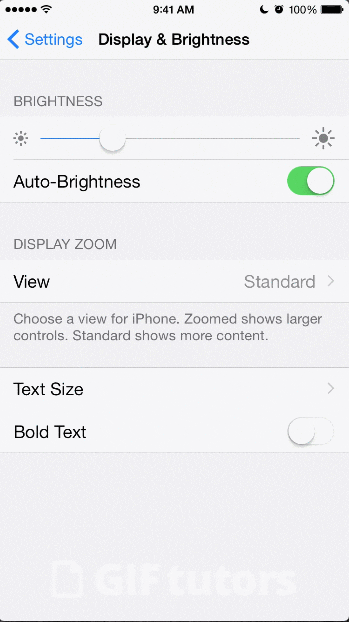
Some users will need to resize the text on a page for the text to be legible to them. This means that as a designer you will need to keep this aspect in mind. A poorly designed page may not resize well. What that means is that the text on the page can overlap and makes things even more difficult for the user.
Moving or Flashing Content
Carousels are a good example of this type of content. If your page has such content it is important to remember that not everyone reads at the same pace. Secondly, flashing or blinking content can cause problems for people with epilepsy.
The WCAG has set certain guidelines on such types of content. This page should give you more information about what you should check for on your website.
What’s Next?
There are many other aspects of accessibility that we could talk about. However, WalkingTree Technologies is hosting a webinar on this very topic (Accessibility – User Experience Designed for All).


Your article helped me a lot, is there any more related content? Thanks!