

Blogs
5 Aspects You Need To Know About Dashboard Design and Layout
Welcome back to the Dashboard Design Principles series! If this is your first time here, part 1 will help you catch up.
In Part 2, we’ll consider 5 aspects about the dashboard design and layout that can help you create a dashboard that has value to its user.
1. Carefully consider your layout
Taking the time to research good metrics and charts adds value to your dashboard. However, taking time to think about their placement in your dashboard is more important. A poor layout can lead to the user seeing irrelevant information first, leading to a frustrating experience.
A principle you can keep in mind is to place key metrics on the upper left corner of the screen, and the reason behind this is that research shows that most cultures read from left to right and intuitively look, first, at the upper left of a page. Hence placing key metrics to the upper left of the screen instantly adds value.
Another layout principle that will improve the quality of your dashboard is to present an overview of key trends. When a user views the dashboard, he/she should be able to view key trends at a glance. This sets the tone for the entire experience and can help channel a user’s thoughts.
A third layout principle involves taking into consideration white space, a.k.a negative space. The principle – evenly space out your margins and padding. Margins define space between elements and padding defines space inside the element. The key to achieving this principle is to strike a balance between the two. Remember, negative space will impact the composition of your dashboard, affecting the user’s focus.
2. Do not be liberal with your color choice
A good principle to follow will be to choose the color scheme of your company’s logo since it identifies the brand. Another principle is to pick two or three colors and stick to them. If you aren’t sure which colors go well together, you can always refer to the color wheel. Your goal is to identify the colors that compliment each other to improve the aesthetics of your dashboard. Here’s a great reference.
Gradients are also a great way to improve the aesthetics of your dashboard. A simple gradient can make the design look new, it can be used to emphasize elements, and can bring in the illusion of depth to what otherwise is a flat image. However, a key aspect to keep in mind – strictly with regards to gradients is – never use complimentary colors to create a gradient.
Case in point:

Image showing why complimentary colors don’t work for gradients
Your best option will be to choose analogous colours – which are colors of the same shade.
Case in point:

Image showing why analogous colors work for gradients
However, designers can ruin a gradient even after choosing analogous colors. The problem lies in selecting highly saturated colors – these can be very taxing to the eyes.
Case in point:

Image showing why highly saturated analogous colors don’t work for gradients
The problem is, they don’t blend well, and are distracting.
Lastly, while considering colors, take into account the emotion they convey. To most people, red is alarming, green creates a positive emotion, while blue is calming. Doing a little research to understand what emotion the colors you wish to use convey, will go a long way in improving your color choices.
3. Interactive elements and animations
Dashboards must be interactive. A user should be able to click an element and dig deep; gain further insights into trends, or metrics, or values of their choosing. To be able to do this, consider adding drill-throughs, click-to-filter, and widgets like time-interval to your design.
Drill-throughs are great because they allow the user to access detailed and specific information on a particular variable, element, or KPI, without overcrowding the dashboard. Decision makers can use it to leverage detailed insights on the number of active customers, or sold units, or even net profit.
The click-to-filter option enables users to leverage the dimensions of charts and graphs as temporary filter values. It can be effectively used to extract specific data sets.
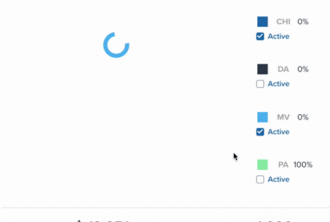
The time-interval widget can help users to amplify specific time scales – which means a user can filter and view data by day, weeks, months or even years.
This setup will ensure the dashboard doesn’t become cluttered while interactivity ensures you don’t miss out on adding important data. Additionally, chart animations are another essential feature you must add to your dashboard. They enhance the overall appearance of your dashboard.
4. Let simplicity be your priority
Chart creation sections have a lot to offer and it can be tempting to use everything. Many dashboards include frills like frames, backgrounds, effects, and grid lines. However, the question you should be asking is; is there a reason I should be applying this frill? If you can’t find a reason, it probably doesn’t need to be there.
Keeping things simple when adding labels to your charts will also enhance your dashboard visuals. The goal here is to keep your fonts simple, legible, and their color should be appealing. Try not to add too many pictures and use simple text to convey your thoughts.
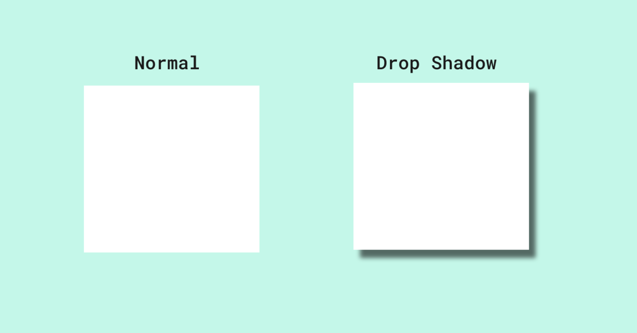
Adding shadows is another effective and simple way to enhance your dashboard. A simple drop shadow can highlight a certain area or add depth. This small change can shift a user’s focus and act as a guide; showing them the information they need to see first, and then letting them explore the rest after.
Lastly, ensure that you maintain consistency when it comes to labels, fonts, and any numbers you may use. For example, maintain consistency with your font choice, and size – for the fonts you’ve used as descriptions. Using different fonts in such a case is a designing error and must be avoided.
5. Optimize your dashboard for multiple devices
Building a dashboard for a mobile or tablet device is now a requirement. This helps make decisions, and answer important questions on-the-go. Something that you can keep in your mind while optimizing your dashboard is that the mobile screen is a lot smaller than a desktop. That means you have less space to work with, and you’re designing for bigger fingers.
The first thing you should consider is what information you’re going to present. Since you’re working with less space, remove information that is irrelevant. Ideally, keeping current information is a great call. Also, the information you present should be at a high level only. Don’t go into too much detail since the dashboard will get too cluttered.
Lastly, ensure the buttons, functions, and scrolling options are of appropriate size, such that any hand size can use them seamlessly. Remember, your goal when designing for a mobile or tablet device is to ensure the information you present is valuable, and immediately visible.
Applying these five points, and the five from part 1 of this two part series, will help you create dashboards that are insightful, easy to use, and aesthetically pleasing.
If you want to know what other steps you can take to build better dashboards, our webinar on optimizing dashboards can give you further pointers. We will also have a live Q&A session where we can continue our discussion.