

Blogs
Creating Data Entry Intensive Application using Ext JS 6.5 Modern toolkit

Various industries like healthcare, life-sciences research, FinTech, surveys, etc. create applications that are very data-entry intensive as it is expected to capture various detail about an individual or an incident for further consumption so that right offering/service can be provided. Here are some of the forms from different industries to get an idea of what is expected from a UI framework if it has to offer data-entry features:
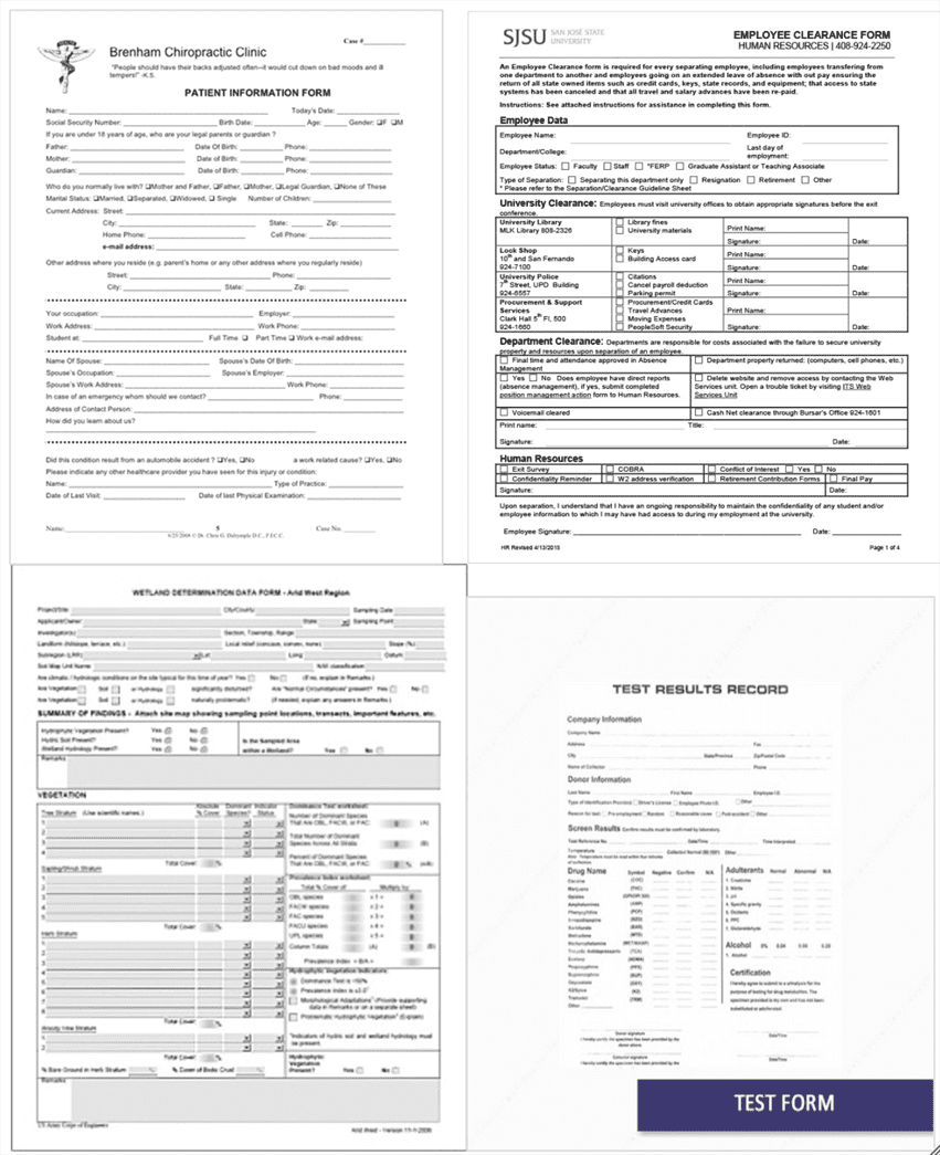 Courtesy: Google search
These forms have complex requirements related to how the fields are laid out and the rules around what is considered as a valid value. The new release of Sencha Ext JS 6.5 framework has made significant enhancements to Modern toolkit. Earlier we talked about how one can start creating universal apps for Desktop, Tablet, and Phone using Modern toolkit. This article describes the features of Modern toolkit that you can use to create data-entry intensive applications.
For more in-depth understanding about designing, developing and testing data-entry intensive application using Ext JS 6.5 Modern toolkit you may want to listen to the Webinar recording:
 Form
Form
Form acts as the main container for fields – such as number field, text field, etc. – and offers layout config to let you create any complex form. In addition to this, form also offers functionality related to form data submission to a remote service or load data into the form fields using a data model.
There is an additional fieldpanel (Ext.field.Panel) container that lets you add fields like form panel but does not provide submit feature. The container is useful in two cases – (1) when you feel a need to nest one form panel inside other to get the field layout right. Since, HTML5 Form Content Model does not allow nested forms, you can use fieldpanel instead (2) when your form submission is handled by a custom application logic rather than the form panel submit mechanism.
Fields
All the fields are defined as part of Ext.field package. Generally all required form fields are available. One field that you may miss is display field. In case you just want to show some text you may use Ext.Label class but, today, it may require some styling to gel with the rest of the form fields and their labels.
Each of the fields allow you to configure where the label shall appear, its width and how the label and associated field control shall adjust in case the label is short or long.
In case you have to group certain fields together, you can use fieldcontainer component. E.g. you can create a fieldcontainer to contain First, Last and Middle name fields and align them using the layout configuration, as shown below:
Form Validation
Validation is key to reducing data entry errors. There are two things to validation – (1) different types of validations that can be carried out on the field value and (2) when there are validation errors, how to report them back to the user.
Different validations
- Field level validation – These are very basic validations where you indicate what field is required and what is optional. The framework takes care of validating field value and notifying the user when the validation fails. Also, based on the field type you can use additional configuration and let the framework validate the value for you. E.g. for number field you can set minValue and maxValue to limit the user input to a number range – e.g. age value.
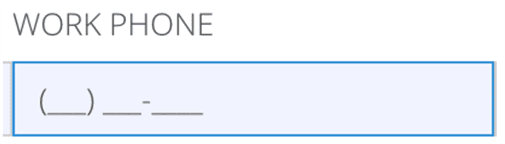
- Input mask – Using input masks offers visual assistance while entering value in a field and also allows configured keyboard inputs. Here is a text field with input mask that shows the format and only allows numbers:
- Field data validation – You can use validators to configure advance validation rules. You can configure one or more rules and all of them would be applied to validate the field value. E.g. validating a credit card number using Luhn Algorithm.
- Cross-field validation – View-Model is the right place for such validations as it requires access to other field value(s) to determine the validity of a field value. E.g. in a date range scenario To Date must be after From Date. Also, if needed, additional field level configurations can be set using the data-binding between field config and view model.
- Business rule validation – Since these are application logic and not view logic, you shall use model level validation. Each model can be configured with validators. Also, custom business rule validation can be carried out before submitting form data.
Error reporting
You can use errorTarget field level configuration to indicate how an error shall be reported to an user. E.g. on a desktop you may choose to show the error as qtip whereas on a phone you may want to show the error message just below the form field. To customize error, you can also use errorTpl and error configurations. Here are some of the ways errorTarget can help you to report error:
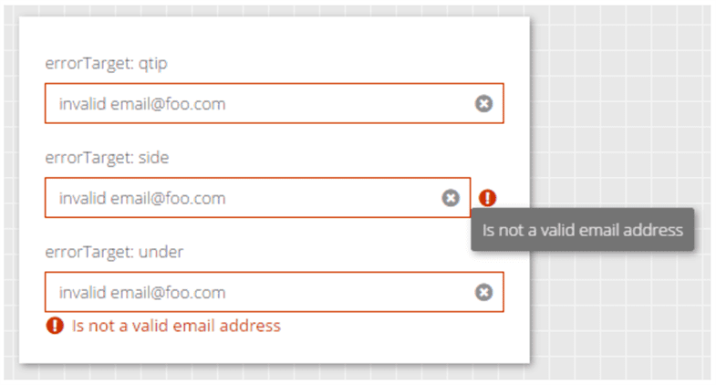 Courtesy: Sencha ExtJS 6.5 examples
If you are looking for custom error handling and reporting, you can use the combination of APIs such as validate, isValid, getErrors to get the field wise errors and report them as per your custom application need – e.g. as toast message or to a specific area of the application.
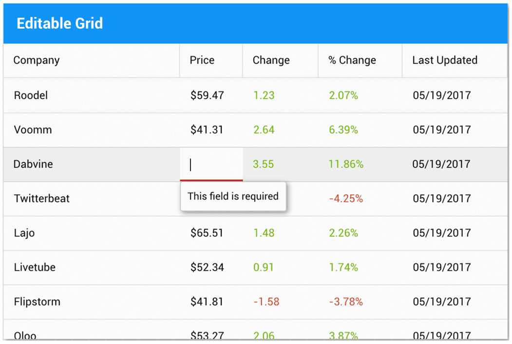
Grid Cell Editing
Cell editing plugin has been newly introduced in 6.5, which you can use to offer edit capability on your grid cells. The plugin class – Ext.grid.plugin.CellEditing – uses Ext.Editor class to show editor for columns that are marked as editable. It can help you build this kind of form section:
 To validate input data you shall make use of validators config on model that is linked with the grid. Following is an example showing validation on cell:
 Courtesy: Sencha Ext JS 6.5 Modern examples
Styling
Sencha Modern toolkit offers out-of-box themes – Material, iOS, Triton, Neptune – and various field and form level CSS and style configurations to fully customize the look-n-feel of a form.
Accessibility
Ext JS 6.5 Modern Toolkit does not have support for following Accessibility features:
- High-contrast theme
- Auto focus
- Tab sequencing
- Attaching screen readers
So, if your application has strict accessibility requirements, you should use Classic toolkit (and later migrate to Modern) or wait for the accessibility features to be added to the Modern toolkit.
Summary
With full client-side data management, data connectors, rich themable components, complex layouts – Ext JS 6.5 Modern toolkit offers complete capabilities to build data-entry intensive applications. However, it lacks heavily on the Accessibility requirements and must be evaluated for your application. You can create any kind of complex data-entry experience to improve the operator efficiency and reduce data errors.
We love listening to customer problems and solving them. Feel free to contact us with your questions.
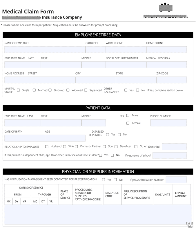
Just to give you some idea about what can be done with Ext JS 6.5 Modern toolkit, here are some of the forms created using it:
Example #1: A new patient record form to capture complete patient record
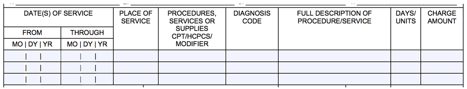
Example #2: Medical claim form for a healthcare provider
 What’s Next?
- Webinar recording
- Try Ext JS 6.5 components and features
- Explore Ext JS API docs
- Read about Sencha Ext JS