
Blogs
An Objective Walkthrough of Ext JS 5 Charts Architecture
Overview
In the Sencha Ext JS 5 Charts Architecture blog, we discussed Sencha Charts that lays down the foundation for this article. In this article, we would pick up an existing chart implementation and make use of the described architecture to understand its implementation. This shall help us –
- understand how the architecture has been applied in a real implementation
- get a more practical understanding of the kind of encapsulation that different classes – axis, series, sprite, engine, etc. – provide
- understand the sequence of class interactions that are required to create and render a chart
- understand what it may take to implement a custom chart
- understand how well the Sencha Charts can be used with Ext JS 5 as well as Sencha Touch
Walkthrough of an existing CandleStick Chart
Let us look at the Stock App that comes along with Sencha Touch Example and see how these classes have been used to achieve the desired behaviour. When you download and extract the Sencha Touch SDK, you would find the source code in examples/stockapp folder.
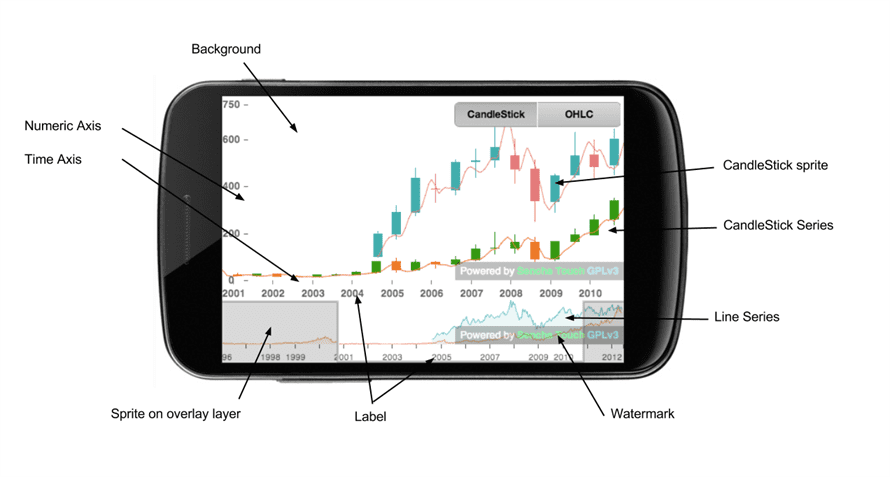
Design
The Stock App has two charts:
- to show the CandleStick/OHLC
- to show the preview with a range mask to allow the user to resize the preview area
There are certain event handlings put in place to sync the CandleStick chart with the preview area that is visible to the user by dragging the handlers on the RangeMask. We would limit our focus on how CandleStick chart and the RangeMask custom sprites have been implemented.
The below diagram shows the classes that the involved in the application and their connectedness:
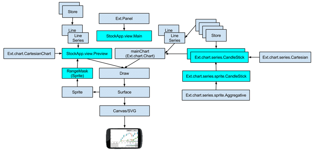
In the above diagram, we have highlighted the classes that are responsible for showing the candlestick on the top and the preview area at the bottom, which shows two line series and a custom sprite – RangeMask – added to the overlay surface of the preview chart.
CandleStick series uses CandleStick sprite class to take care of the actual drawing.
CandleStick sprite’s renderAggregates method takes care of rendering the sprites based on the CandleStick/OHLC graph logic.
RangeMask extends Ext.draw.sprite.Sprite. The render method implements the logic to draw the rectangular areas along with handlers using which a user can change the preview area by dragging the handlers. This sprite is added to the overlay layer so that it appears on top of the series.
Sequence Diagram
Let us see what is the sequence of calls that are made across the main classes that we have listed earlier to achieve the desired output.
I have broken it into two parts:
- Construction & initialisation
- Rendering
Construction & Initialisation
In this stage the different classes are instantiated and initialised and they are prepared to enter into the rendering stage
Preview with RangeMask

CandleStick
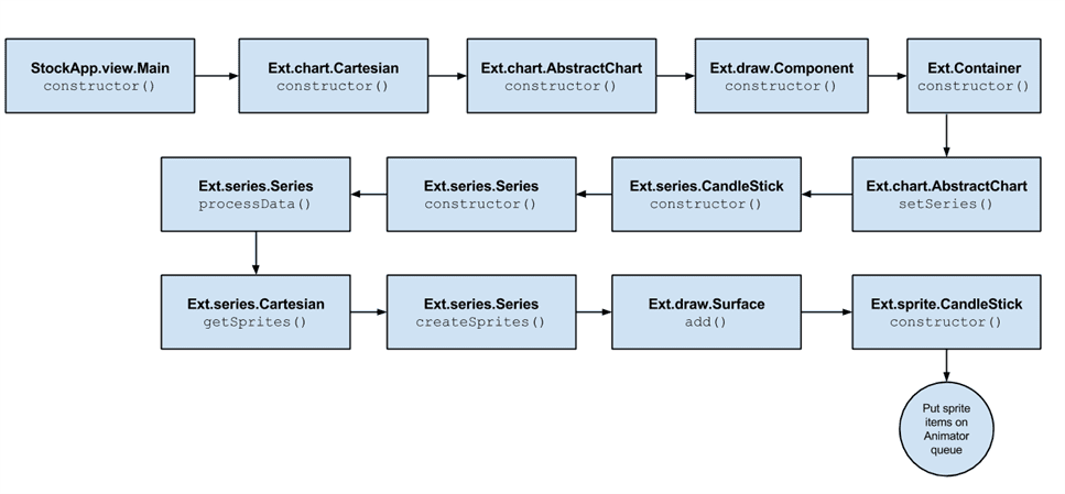
Rendering
In this stage the actual visual output is produced that is visible on the screen

This completes our walkthrough.
Summary
I hope that this article would have helped you to understand the overall Sencha Charts architecture and see how it is applied to a real implementation. This shall prepare you, better, to start planning the implementation of your custom charts.
References
- Ext JS Charts Kitchen Sink
- Sencha Charts Kitchen Sink
- Sencha Ext JS 5.0.0 Docs
- Sencha Ext JS 5.0.0 API Documentation
- Ext Charts Upgrade Guide
- HTML5 Canvas Tutorial
- Dive into HTML5 Canvas
- Scalable Vector Graphics







I do see CandleStick charts available in ExtJS5.
If some chart is not available then like any Sencha Components, you can very well create your own charts.
Cheers!
Hi,
Nice article !
Is a similar stock chart available on ExtJS 5 ?
If no, is it possible to use Touch code in ExtJS 5 ?
Thanks,
Ludo