

Blogs
A Step by Step Guide to Encapsulation, Generation, and Integration of Angular Elements
The software industry is driven by innovation, improvisation, and implementation of several new tools day in and day out. With myriads of tools to choose from in a software development project, developers find it hard to narrow down on one that fits the bill. In the previous blog, we looked at an in-depth review with examples about the functional part of web components. Now, we will see Angular web components also known as Angular elements. As an Angular developer, you may have hands-on experience in Angular 6+ projects and Angular components. However, if you are new and do not have Angular CLI, then run the command as follows
$ npm install -g @angular/cli for more information, you can refer angular.io.
Let’s create a new project as follows.
$ ng new AngularElements
Once the project creation process is completed, ensure the project is up and running, then run the command as follows.
Once the project creation process is completed, ensure the project is up and running, then run the command as follows.
$ ng serve and go to http://localhost:4200 in your browser. If you are able to see the screen as follows then we are good to go.
Angular Component Encapsulation:
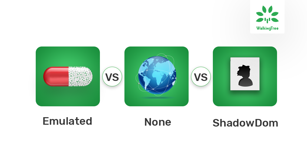
Before we jump into the process of creating the angular elements, let’s understand about component encapsulation. Angular provides three types of encapsulations to manage the styles and elements in the DOM, the default one is Emulated. The available options are Emulated, None, Shadow DOM (It was being called as Native and deprecated now). Let’s see what these options are
- Emulated: This is a default option. As the name suggests, it emulates the native scoping of the style. It does that by adding an attribute that contains a surrogate id to the Host element, preliminary processing of the style rules that are provided by the style Urls or styles, and also adding new host elements attribute to all the selectors. In simple words, it provides style encapsulation and not the shadow DOM.
- None: Doesn’t provide any style encapsulation or template.
- Shadow Dom: This involves using modern shadow DOM and creating a Shadowroot for the Component’s host element. So it provides the shadow DOM and style encapsulation.
Angular Component Encapsulation
Component with ViewEncapsulation.None (encapsulation None):
Created a main component to show the content and added style for the div tag (see the component metadata).
app.component.ts:
import { Component, ViewEncapsulation } from '@angular/core';

@Component({
  selector: 'app-root',
  template: `<div>This is main component</div>
              <app-child></app-child>`,
  styles: [`
            div{
              background-color: yellow;
              color: green;
              width: max-content;
          }
        `],
  encapsulation: ViewEncapsulation.None
})
export class AppComponent {}
We have created another component named ChildComponent to show the content which is incorporated with AppComponent and no style for the div tag (see the component metadata).
child.component.ts
import { Component } from '@angular/core';

@Component({
  selector: 'app-child',
  template: `<div>This is child component</div>`
})
export class ChildComponent {}
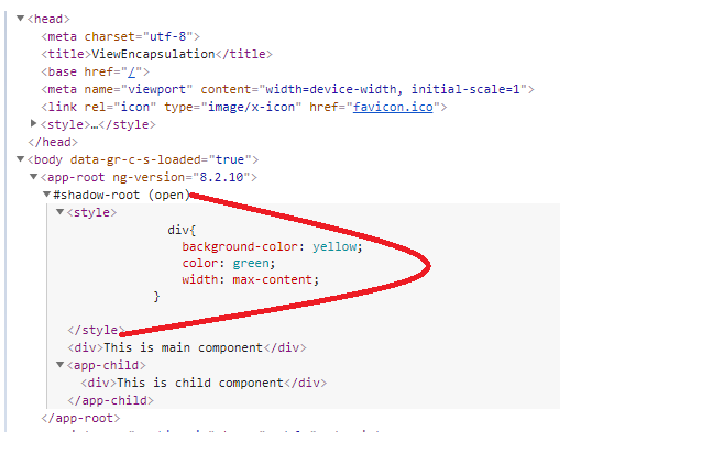
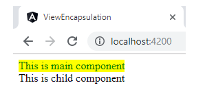
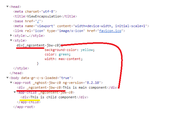
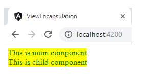
In both the above components, we are using div tag to show the content but no styles are defined for the ChildComponent. But, if you see the application, you will find that the div style has been applied to both the components like the below screen.
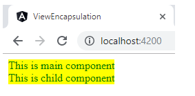 This happened because we are using the encapsulation property of AppComponent as None. If you look at the browser elements as follows, you can see div style has been added to the header section of the DOM like the below screen and there is neither style encapsulation nor shadow dom. So this style will be applied to all nodes of the DOM.
Component with ViewEncapsulation.Emulated (encapsulation Emulated):
In the example below, the AppComponent is modified to emulate encapsulation to see how it differs from others.
app.component.ts:
import { Component, ViewEncapsulation } from '@angular/core';

@Component({
  selector: 'app-root',
  template: `<div>This is main component</div>
              <app-child></app-child>`,
  styles: [`
            div{
              background-color: yellow;
              color: green;
              width: max-content;
          }
        `],
  encapsulation: ViewEncapsulation.Emulated
})
export class AppComponent {}
If you see the application, you will find that div style has been applied to the only AppComponent like the below screen.
This happened because we are using the encapsulation property of AppComponent as Emulated. It encapsulates the styles, i.e. style is scoped only to the corresponding component and doesn’t create any shadow dom, but manages through surrogate id. If you look at the browser elements as follows, you can see div style has been added to the header section of the DOM, but that is associated with the surrogate id, so this style will not be applicable to all nodes of the DOM.
Component with ViewEncapsulation.ShadowDom (encapsulation ShadowDom/Native):
AppComponent is modified to create shadow dom as follows to see how it differs than others.
app.component.ts:
import { Component, ViewEncapsulation } from '@angular/core';

@Component({
  selector: 'app-root',
  template: `<div>This is main component</div>
              <app-child></app-child>`,
  styles: [`
            div{
              background-color: yellow;
              color: green;
              width: max-content;
          }
        `],
  encapsulation: ViewEncapsulation.ShadowDom
})
export class AppComponent {
}
When you look at the application, you will find that the div style has been applied to both the components as follows.
This happened because we are using the encapsulation property of AppComponent as ShadowDom. It creates separate shadow dom, and the style is scoped to that shadow dom only. If you look at the elements of the browser, you can see that the div style has been added to the header section of the shadow dom, and so the style will be applied to all nodes of the shadow dom only.

What to use when?
By going through the above available encapsulation methods, we understand that “None” can be used to make the global styles to all nodes of dom, “Emulated” can be used to encapsulate the styles to the corresponding component only and “ShadowDom” can be used to make the global styles to all nodes of corresponding shadow dom only. As per the webcomponents latest specifications, “ShadowDom” is the right choice to convert Angular component as Angular element to avoid code collision. Hope this gives you some idea on component encapsulation methods. If you have any doubts or if you’d like to know more, feel free to contact us.
Let us move on to the process of creating Angular elements (web component).
Creating Angular Elements:
Also known as web components, angular elements are angular components that are packaged as custom elements. Angular elements are introduced in Angular 6. There are a lot of preconceived ideas about creating a custom element, but in reality, it is a very straightforward and simple process. When the component is transformed into custom elements, it makes all the required angular infrastructure available in the browser. Further, it connects the component defined view with the data binding and change detection, and the angular functionality is mapped to the corresponding native HTML equivalents. To further support the change detection and data binding functionality, a self-contained and minimal angular framework version will be injected as a service.
In simple words, Angular takes care of converting the Angular component as a web component, which works like regular HTML tags in the browser and can be integrated with any web application. Currently, custom elements are a web platform and are supported by Firefox, Chrome, Safari, Opera, and is available in other browsers through polyfills (see Browser Support).
Let’s create a component which accepts input from a consumed application (to ensure input parameter behaviour), end-user (to ensure two way data binding) and returns modified data (to ensure output parameter behaviour) to the consumer after some action (click event). You can see the below code of SharedComponent.
shared-data.component.ts
import { Component, OnInit, Input, Output, ViewEncapsulation,EventEmitter } from '@angular/core';

@Component({
  selector: 'app-share-data',
  templateUrl: './share-data.component.html',
  styleUrls: ['./share-data.component.css'],
encapsulation:ViewEncapsulation.ShadowDom
})
export class ShareDataComponent implements OnInit {

  @Input() info:any = {};
  @Output() message = new EventEmitter();
  userInput:any="";
  constructor() { }

  ngOnInit() {
  }

  sendMessage(){
    this.message.emit("Hello "+this.info.name+", "+this.userInput);
  }
}

share-data.component.html
<div>
    <h1>User Name: {{info.name}}</h1>
    <input type="text" [(ngModel)]="userInput"/>
    <button class="button" (click)="sendMessage()">Click Here</button>
</div>

share-data.component.css
div {
    border-radius: 5px;
    background-color: #f2f2f2;
    padding: 20px;
    width:max-content;
  }

input[type=text] {
    width: 60%;
    padding: 12px 20px;
    margin: 8px 0;
    display: inline-block;
    border: 1px solid #ccc;
    border-radius: 4px;
    box-sizing: border-box;
  }

.button {
    background-color: #4CAF50;
    border: none;
    color: white;
    padding: 14px 28px;
    text-align: center;
    text-decoration: none;
    display: inline-block;
    font-size: 16px;
    margin-left: 5px;
    cursor: pointer;
  }
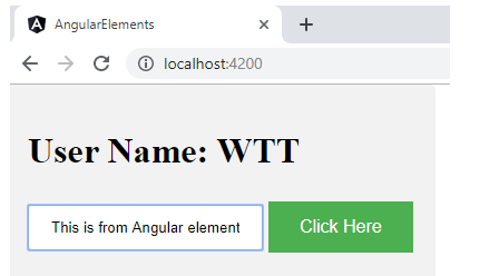
Before we start the component conversion, make sure to check the behaviour. If you are able to see the screens as follows we are good to go.
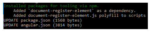
Add @angular/elements, use the Angular CLI to automatically set up your project with the correct polyfill.
$ ng add @angular/elements --name=AngularElements
It updates your package.json by adding @angular/elements, document-register-element as dependencies and updates angular.json as well. You can see the output as follows.
After adding Angular elements, modify app.module.ts to create our component as Angular element instead of bootstrapping the application. Let’s change app.module.ts as follows:
import { BrowserModule } from '@angular/platform-browser';
import { NgModule, Injector } from '@angular/core';
import { FormsModule } from '@angular/forms';
import { createCustomElement } from "@angular/elements";

import { ShareDataComponent } from './share-data/share-data.component';

@NgModule({
  declarations: [
    ShareDataComponent
  ],
  imports: [
    BrowserModule,
    FormsModule
  ],
  providers: [],
  entryComponents: [ShareDataComponent]
})
export class AppModule {

  constructor(private injector: Injector) {
    const customElement = createCustomElement(ShareDataComponent, { injector });
    customElements.define('input-output', customElement);
    }
    ngDoBootstrap() {}
 }
Package Angular Element:
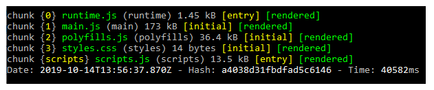
All set to package this web component, build the application using Angular CLI as follows $ ng build --prod --output-hashing=none, you can see the output as follows and these files will be stored in the dist/AngularElements folder.
We have to bundle these output files as a single file to load this one as js file. Let’s add a new file called make-element.js to the project with the required script to make our web component as a single file.
const fs = require('fs-extra');
const concat = require('concat');

(async function build() {
  const files = [
    './dist/AngularElements/runtime.js',
    './dist/AngularElements/polyfills.js',
    './dist/AngularElements/scripts.js',
    './dist/AngularElements/main.js'
  ];

  await fs.ensureDir('elements');
  await concat(files, 'elements/input-output-element.js');
})();
This script concatenates the output files and generate a single file and save it in the elements directory as input-output-element.js. It needs two packages (concat & fs-extra), add them as follows.
$ npm install --save-dev concat fs-extra
Modify build command in the package.json as follows.
"build": "ng build --prod --output-hashing=none && node make-elements.js"
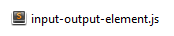
Now, run the command as follows to generate the input-output-element.js .
$ npm run build
You will find a new folder in the project root directory named elements with a input-output-element.js file which has your web component.
Test your Angular element
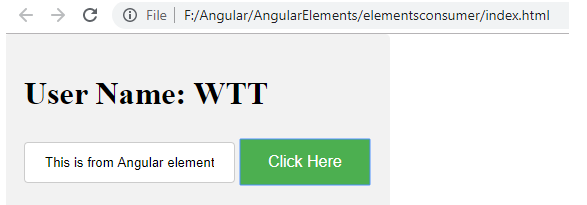
Create an index.html with the following contents:
<html>
<head>
<script src="input-output-element.js" ></script>
</head>
<body style="margin:0px;">
<input-output></input-output>
<script>
var info={name:'WTT'};
var element = document.querySelector('input-output');
element.info=info;
element.addEventListener('message', function(data){
			alert(data.detail);
		});
</script>
</body>
</html>
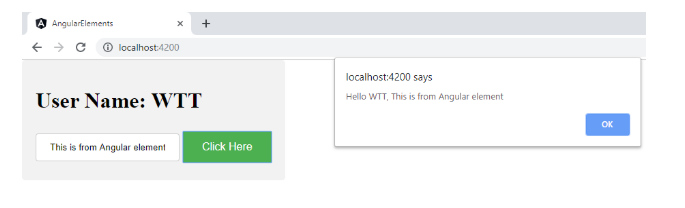
Open the HTML file to ensure that this functions the same as what we have seen as Angular component.

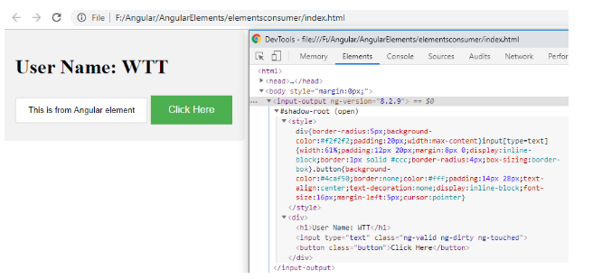
Conclusion
I’m sure that the what, why, and how would have given you a clear idea on the different options of the ViewEncapsulation and shadow dom role in the web component. It is interesting to consider the examples of how to package the component as a web component and how to integrate with any web application. Regardless of how tiring or at times overwhelming journey our developer community has, there is a light at the end of the tunnel.
With a demonstrated history in working with Angular Elements, WalkingTree Technologies is taking long strides in the Software Development Industry. Our experienced team of experts working on Angular Elements have been working on several domains. Feel free to reach out to us to know more about this and several other exciting technologies.