

Blogs
Understanding the Flutter DataTable with common implementation scenarios

Data represented in a tabular format is easy to understand and interpret. Tabular data also makes effective use of the space giving more information in a small space. It is an important display component often used in applications to render more objective and categorical data.
If you have a requirement to display data in a tabular format, the DataTable widget of Flutter comes handy. Using the datatable widget, you can display a simple table with some basic features.
In this blog, we will understand the usage of this useful widget to display data in a tabular format.
We will use some sample Employee details and render them in a tabular format using the DataTable and its related widgets.
We will define our Employee model with some static data with the following class structure and some static data list.
class Employee {
  String firstName;
  String lastName;
  int id;
  String email;

  Employee({this.firstName, this.lastName, this.id, this.email});

  static List<Employee> getUsers() {
    return <Employee>[
      Employee(
          firstName: "Shubham",
          lastName: "B",
          id: 1001,
          email: "shubham.b@walkingtree.tech"),
      Employee(
          firstName: "HariKrishna",
          lastName: "S",
          id: 1001,
          email: "harikrishna.s@walkingtree.tech"),
      Employee(
          firstName: "Vishnu",
          lastName: "P",
          id: 1001,
          email: "vishnu.p@walkingtree.tech"),
      Employee(
          firstName: "Suman",
          lastName: "R",
          id: 1001,
          email: "Suman.r@walkingtree.tech "),
      Employee(
          firstName: "Prashanth",
          lastName: "K",
          id: 1001,
          email: "Prashanth.k@walkingtree.tech ")
    ];
  }
}
Now we will create the data table demo component as below.
class DataTableDemo extends StatefulWidget {
  @override
  _DataTableDemoState createState() => _DataTableDemoState();
}

class _DataTableDemoState extends State<DataTableDemo> {
  List<Employee> emps;

  @override
  void initState() {

    emps = Employee.getList();
    super.initState();
  }

  @override
  Widget build(BuildContext context) {
    return Scaffold(
      appBar: AppBar(
        title: Text('Data Table Demo'),
      ),
      body: Column(
        children: <Widget>[
          Expanded(
            child: tableBody(
              context,
            ),
          ),

        ],
      ),
    );
  }
SingleChildScrollView tableBody(BuildContext ctx) {
    return SingleChildScrollView(
      scrollDirection: Axis.vertical,
      child: SingleChildScrollView(
        scrollDirection: Axis.horizontal,
        child: DataTable(
          dataRowHeight: 50,
          dividerThickness: 5,

          columns: [
            DataColumn(
              label: Text(
                "First Name",
                style: TextStyle(
                  fontStyle: FontStyle.italic,
                  color: Colors.deepOrange,
                ),
              ),
              numeric: false,
              tooltip: "This is First Name",

            ),
            DataColumn(
              label: Text(
                "Last Name",
                style: TextStyle(
                  fontStyle: FontStyle.italic,
                  color: Colors.deepOrange,
                ),
              ),
              numeric: false,
              tooltip: "This is Last Name",
            ),
            DataColumn(
              label: Text(
                "Id",
                style: TextStyle(
                  fontStyle: FontStyle.italic,
                  color: Colors.deepOrange,
                ),
              ),
              numeric: true,

            ),
            DataColumn(
              label: Text(
                "Email Id",
                style: TextStyle(
                  fontStyle: FontStyle.italic,
                  color: Colors.deepOrange,
                ),
              ),
              numeric: false,
             ),
          ],
          rows: emps
              .map(
                (emp) => DataRow(
                   cells: [
                      DataCell(
                        Text(emp.firstName),
                                      ),
                      DataCell(
                        Text(emp.firstName),
                                      ),
                      DataCell(
                        Text('${emp.id}'),
                                    ),
                      DataCell(
                        Text('${emp.email}'),
                      ),
                    ]),
              ) .toList(),
        ),
      ),
    );
  }
}
I have repeated the same data, in order to show more data in the data table and included the DataTable widget inside a SingleChildScrollView widget to be able to scroll through the data and view the contents of the table.
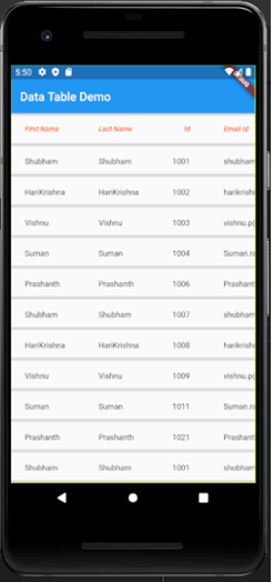
The basic table with the Employee data looks like below:
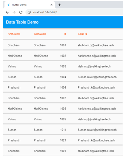
DataTable on the Web
The same code will run for the web and can be enabled for the web as below:
To enable web, first change the flutter channel for development as currently web is enabled in the beta channel.
flutter channel beta
 flutter upgrade
 flutter config --enable-web
After enabling web for your flutter environment, you can add web to your project by using the below command in your application folder,
flutter create .
Now you can run the application using the below command and you can view the data table in web view
flutter run -d chrome
This will launch the application in the Chrome browser as shown below:
 Now let’s understand the widgets involved in displaying this tabular formatted data.
DataTable
This is the top-level widget to render the table. This includes the table level properties like dataRowHeight, dividerThickness, sortColumnIndex, etc. The columns property takes the list of Column Header details provided as a list of DataColumn Widget. The rows property takes the list of the actual row content to be displayed in the table provided using a list of DataRow widget
DataColumn
This is the widget using which we can provide the column header details like the label, header styling, numeric indicator, tooltip, etc.
    DataColumn(
              label: Text(
                "First Name",
                style: TextStyle(
                  fontStyle: FontStyle.italic,
                  color: Colors.deepOrange,
                ),
 	 numeric: false,
              tooltip: "This is First Name",

            )
              )
DataRow
This is the widget using which we provide the row-level details of the table. It has properties like selected, onSelectChanged, which can be handled to specify behaviour on specific row selection. These properties are provided so we can implement as per our requirements.
For each cell data, we provide the cells property to give the table cell level data to be displayed in the row provided, using the DataCell widget.
DataCell
This is the lowest level widget of the datatable which handles the cell level data and its behaviour. It can be a Text, a dropdown or a child widget as you define. It can handle properties like showEditIcon and onTap, which are provided as placeholders which can be implemented as per our requirements.
Now that we understand the basic structure of the DataTable and its related widgets, let’s now explore some possibilities of implementing the Data Table using the existing properties as per our needs and providing the implementation for the same.
Dynamically generate columns from a list of column names
In the earlier code snippet, we explicitly provided the list of all the column names, but the same can be generated using a map on a list of column details data as below:
 columns: labels
              .map(
                (name) => DataColumn(
                    label: Text(
                      name['name'],
                      style: TextStyle(
                        fontStyle: FontStyle.italic,
                        color: Colors.deepOrange,
                      ),
                    ),
                    numeric: name['num']),
              )
              .toList(),
Including checkbox for row selection and deselection
If we want to display a checkbox at each row-level and handle the selection and deselection, we can use the showCheckboxColumn property at DataTable level, to show the checkbox field and handle the selecting logic using the onSelectChanged property at the DataRow level.
A separate list is maintained to keep track of the selected rows which can be used to perform any action on the selected data.
DataTable         showCheckboxColumn: true,
DataRow(
                    selected: selectedEmps.contains(emp),
                    onSelectChanged: (b) {
                      print("Onselect");
                      onSelectedRow(b, emp);
                    },
//Function to handle selection change at row level where selectedEmps is a list at widget level to
handle the list of selected Employees
onSelectedRow(bool selected, Employee emp) async {
    setState(() {
      if (selected) {
        selectedEmps.add(emp);
      } else {
        selectedEmps.remove(emp);
      }
    });
    print(selectedEmps);
  }
Deleting row on selection
The data is being dynamically loaded from a list so, in order to delete any selected row, which is being maintained in a separate array as indicated by the checkbox selection, the list can be modified as part of the state to implement the requirement. The same approach can be used to add data dynamically to the table.
In the current example, an action button is added to the AppBar, where the action is handled to remove items from the main list on deletion.
 appBar: AppBar(
        title: Text('Data Table Demo'),
        actions:[
          IconButton(
            icon: Icon(Icons.delete),
            onPressed: (){
              setState(() {
                selectedEmps.forEach((element) {
                  emps.remove(element);
                });
              });
            },
          )
        ]
      ),
Handling sorting at the column level
Sorting the data as per a specific column value is another common requirement for tabular format. DataTable widget provides placeholder properties, which need to be implemented in order to achieve sorting functionality.
The properties sortAscending and sortColumnIndex can be added at the DataTable level which indicates at the header level with the arrow icon which column is sorted and in which order(ascending or descending). sortAscending takes the boolean value and sortColumnIndex is the index of the column as the sorted one.
  sortAscending: sort,
          sortColumnIndex: selectedSort
onSort property provided in the DataColumn widget can be implemented to handle the sorting action, which gets invoked whenever the user taps on the specific column and the values of ascending(bool) and the column index are passed as the parameters to the handler function to be implemented.
onSort: (columnIndex, ascending) {
                   setState(() {
                      sort = !sort;
                      selectedSort = columnIndex;
                    });
                    onSortColumn(columnIndex, ascending);
                  },
The onSortColumn function is a custom function for handling the specific sorting logic based on the column datatype.
You can find the complete code for the basic data table demo here@codepen.
Conclusion
In this blog, we explored the DataTable widget provided by Flutter for rendering data in a tabular grid format. This widget is useful and provides the basic functionalities to render data effectively in a table. We also saw some of the common scenarios to implement the DataTable widget to suit your requirements.
Let us know in the comments if you are trying to use this widget in order to achieve some specific behaviour.


I have received below exception while using above code.
No MediaQuery ancestor could be found starting from the context that was passed to MediaQuery.of(). This can happen because you have not added a WidgetsApp, CupertinoApp, or MaterialApp widget (those widgets introduce a MediaQuery), or it can happen if the context you use comes from a widget above those widgets.
Hi Vivek,
You need to wrap your widget or entire app in MaterialApp() widget, then this issue should get resolved.
Hi there,
This was an excellent writeup, and I learned a lot from it. Just one question: is using the double `SingleChildScrollView` a typo, or is that a necessary part of the setup?
“`
return SingleChildScrollView(
scrollDirection: Axis.vertical,
child: SingleChildScrollView(
scrollDirection: Axis.horizontal,
child: DataTable(
“`
Again, an excellent article that has been very helpful. Thank you for sharing!
-Keith
Hi Keith,
Glad you found the blog helpful.
Both the SingleChildScrollView widgets are needed and is used as one each for the horizontal axis and the vertical axis for the table.
Thanks.
Thank you sooooo much Abhilasha Sinha i was stuck at a problem and you’re really helped me out i really appreciate your help good luck on all your endeavors
How can I calculate 2 datacell