

Blogs
Theming in Flutter
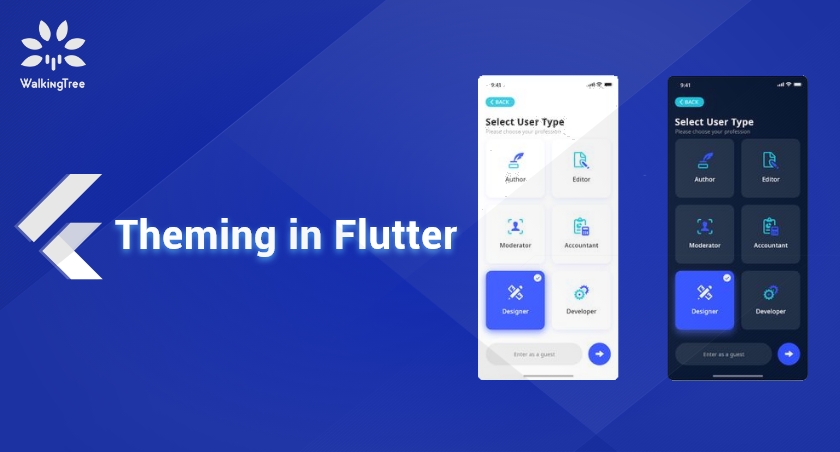
Theming is styling an application so that its look and feel matches your personal design aesthetic or that of an existing enterprise design. You theme your application by controlling its look and feel globally i.e you add the text styles, the icon styles, the primary color, etc. at one place and then propagate them to the entire application, across pages.This gives UI consistency, reduces styling repetition at widget level and helps to make any future global style changes at one place.
As the user interfaces look different on an Android device, from the way they look on an iOS device or a Windows device and so on, the overall user experience is an important aspect while theming an application.
Material Design
Material Design is one such cross platform visual language created by Google. It emulates the real world objects, to give a real world experience to the users, when they interact with user interfaces in their application. It also uses shared components across different platforms in order to give the same user experience.
Material Color System
The Material Design color system can help you create a color theme that reflects your brand or style. The Material Design Color System is a good read to understand this color system.
You can create your custom color theme by picking colors from the material palette with the help of some useful tools like these. Though the second one allows to create a color theme from outside the material color palette also.
Choosing Colors From Your Sample Design
Apart from choosing colors from the given palette, you can choose colors from your sample design also. You can use any color-picking extension to pick such colors. For example, you can add the ColorPick Eyedropper or Colorzilla, etc. to your Chrome browser to get the color hex code from your design.
Material Design Typography and Iconography
Typography is the art and technique of arranging selecting typefaces, line lengths, line-spacing, letter-spacing, etc. to present your design and content as clearly and efficiently as possible.
Iconography is the use of icons e.g. Product icons to visually express a brand’s products, services, and tools.
Flutter Themes
Flutter comes with a beautiful implementation of Material Design, for which you need to have MaterialApp as the top-level widget of your application. The MaterialApp widget wraps a number of widgets that are commonly required for applications implementing Material Design.
On iOS, you can use the Cupertino widget library as it implements the current iOS design language. In this case, you’ll make CupertinoApp the top-level widget of your application.
Flutter ships with two themes inspired by Material Design.
- Light theme – This is the default theme light blue theme.
- Dark theme – A dark theme with teal as the ColorScheme secondary color, to save energy for more battery life and reduce strain on the eye in low light situations.
You can switch to the dark theme by setting the MaterialApp theme property to ThemeData.dark() method. For example,
 Widget build(BuildContext context) {
   return MaterialApp(
     theme: ThemeData.dark(),
     home: HomeScreen(),
   );
 }
Creating Custom Global Theme with ThemeData
The ThemeData class holds color and typography values for a material design theme. Add it to the MaterialApp widget, using its theme property, and configure any of the following properties to create your global custom theme.
- brightness
- primarySwatch
- primaryColor
- accentColor
- scaffoldBackgroundColor
- buttonTheme
- textTheme
- fontFamily
- iconTheme
- appBarTheme
- floatingActionButtonTheme
- and more.
For example,
Widget build(BuildContext context) {
   return MaterialApp(
     theme: ThemeData(
        primaryColor: Colors.red,
        accentColor: Colors.amber,
        scaffoldBackgroundColor: Colors.black,
      ),
     home: HomeScreen(),
   );
 }
Working with Colors
Colors: This class has colors from the Material palette. To access them in code, just call the base color and the shade (optional, usually a hundreds value).
color: Colors.red,
color: Colors.red[400],
Color class: You can use this class for colors outside the material palette, as it allows color values in ARGB (Alpha, Red, Green, Blue) format. Most common way of using it is by passing the hex color code like this, where 0xFF stands for fully opaquecolor:
Color(0xFF42A5F5),
Changing the Primary and Accent Colors
primaryColor: This property holds a single color that becomes the background color for major parts of the app (toolbars, tab bars, etc). This comes with two variants primaryColorLight and primaryColorDark.
accentColor: This property works as an alternative color as it sets the foreground color for widgets (knobs, text, overscroll edge effect, etc).
Rather than creating a theme from scratch, you can call the copyWith() method of the chosen theme to create a copy of this theme but with the given fields replaced with the new values. For example,
Working with Text
You can override the textTheme property of the ThemeData object to set the Material Design Typography for your theme. You can use it to set the headlines, body text, button text, caption and overline.
You can read about the Material Design Type System here. You can also add some extensions like WhatFont to your browser to pick text styles from your sample design.
For example,
Widget build(BuildContext context) {
   return MaterialApp(
     theme: ThemeData.light().copyWith(
        primaryColor: Color(0xff455a64),
        accentColor: Color(0xffffc400),
        scaffoldBackgroundColor: Color(0xffF5F5F6),
      ),
     home: HomeScreen(),
   );
 }
Working with Custom Fonts
Roboto is the default font for Flutter Material Theme but you can use custom fonts also by following these steps. Instead you can follow the Flutter team’s official cookbook.
- Choose any fonts, e.g free commercial Google fonts.
- Download the .zip file of fonts e.g. Open-Sans-Bold.ttf, Open-Sans-Regular.ttf, Quicksand-Bold.ttf, Quicksand-Regular.ttf, etc.
- Unzip this file in your project folder e.g. assets/fonts.
- Open pubspec.yaml file and add fonts property with family, location, weight and style details, under the flutter property.
- Run flutter flutter pub get to include fonts in your project.
Once you have the fonts ready, you can use them in your theme like this:
Widget build(BuildContext context) {
    final ThemeData base = ThemeData.light();

     return MaterialApp(
       theme: base.copyWith(
          primaryColor: Color(0xff455a64),
,          accentColor: Color(0xffffc400),
           scaffoldBackgroundColor: Color(0xffF5F5F6),
           appBarTheme: base.appBarTheme.copyWith(
                                             color: Color(0xff1c313a),
                                             textTheme: base.textTheme.copyWith(
     headline6: TextStyle(
       fontFamily: 'OpenSans',
       fontSize: 28.0,
       fontWeight: FontWeight.bold,
     ),
  ),
                                         ),
                                     )
                                  };
More Custom Globalizations
Same way you can customize more properties of the ThemeData object. These styles will be application wide i.e. they will apply to Card widgets, Textfield widgets, etc., throughout the application.
   Widget build(BuildContext context) {
    final ThemeData base = ThemeData.light();

     return MaterialApp(
       theme: base.copyWith(
          primaryColor: Color(0xff455a64),
,          accentColor: Color(0xffffc400),
,
           // To change the Scaffold background color
           scaffoldBackgroundColor: Color(0xffF5F5F6),
,
          // By default it takes the primaryColor and TextTheme headline6
            appBarTheme: base.appBarTheme.copyWith(
                                             color: Color(0xff1c313a),
                                             textTheme: base.textTheme.copyWith(
     headline6: TextStyle(
       fontFamily: 'OpenSans',
       fontSize: 28.0,
       fontWeight: FontWeight.bold,
     ),
  ),
),

//Theme for icons.
iconTheme: base.iconTheme.copyWith(
  color: Colors.blueGrey,
  size: 26.0,
),


             // Theme for Card widget
             cardTheme: base.cardTheme.copyWith(
               color: Color(0xffffc400),
             ),

             // Theme for Textfield
             inputDecorationTheme: base.inputDecorationTheme.copyWith(
                hintStyle: TextStyle(
                   color: Colors.black[400],
                   fontSize: 16.0,
                ),
             ),
      ),
      home: MyAppPage(),
   );
}
Apply theme colors and text styles to widgets
Descendant widgets can obtain the current theme’s ThemeData object with Theme.of(context). It can be used to apply colors, text styles, etc. at widget level.
For example, if you’ve set the TextTheme object like this:
textTheme: ThemeData.light().textTheme.copyWith(
  headline6: TextStyle(
    fontSize: 18.0,
    fontWeight: FontWeight.w400,
  ), //….
 ),
And you want to apply headline6 to a normal text then you can apply like this:
Text(
  "BMI",
  style: Theme.of(context).textTheme.headline6,
 ),
Having More Granular Control
To override the app-wide theme in a specific part of your application, you can wrap that section of the app with the Theme widget. You can then set its data property by extending from the parent theme with Theme.of(context).
This example code changes the Container’s color to red. It uses a Builder widget to separate the parent theme’s BuildContext from the child’s BuildContext. Alternatively, you can extract the Container in it’s own class. The reason being that Theme.of(context) won’t be able to find the Theme widget in the same subtree as this is how the InheritedWidget works.
Expanded(
 child: Theme(
   data: Theme.of(context).copyWith(primaryColor: Colors.red),
   child: Builder(
     builder: (BuildContext context) {
       return Container(
           padding: EdgeInsets.all(15.0),
           color: Theme.of(context).primaryColor,
           child: Text(
             'This Container overrides primaryColor',
             style:  Theme.of(context).headline5,
           ),
        );
     },
  ) ) ),
Using the ColorScheme
Flutter also introduces the colorScheme property with a set of twelve colors based on Material specifications that can be used to configure the color properties of most components. In future, the Flutter team plans to style the material components with the defined colorScheme. To use the colorScheme, you’ll have to call the ThemeData.from() constructor.
Widget build(BuildContext context) {
 return MaterialApp(
   theme: ThemeData.from(
    colorScheme: ColorScheme.light().copyWith(
      primary: Color(0xff455a64),
      primaryVariant:  Color(0xff1c313a),
      secondary: Color(0xffffc400),
      secondaryVariant: Color(0xffc79400),
      // ...More
     ),
   );
}
Externalizing the Theme
In all the above examples, we made theming changes in the main.dart file only. But instead of messing with the main.dart file, we can externalize our theme code in separate files. For example, we can have a separate file for color constants, text styles and main theme code. This will help to keep all our colors and text styles at one place so that maintaining them is easier. You can find a link for the complete code below.
Separate Light and Dark Themes
You can also create two custom light and dark themes in two separate classes and configure them like this using the theme, darkTheme, themeMode properties.
- themeMode.light – by default light
- themeMode.dark – by default dark
- themeMode.system – theme selection will be based on the user’s system preferences. This is default.
For example,
final ThemeData _bmiTheme = AppTheme.buildBmiTheme(); // Theme class for light theme
final ThemeData _bmiThemeDark = AppThemeDark.buildBmiTheme(); // Theme class for dark theme

void main() => runApp(BMICalculator());

class BMICalculator extends StatelessWidget {
  @override
  Widget build(BuildContext context) {
      final ThemeData base = ThemeData.light();
            return MaterialApp(
  	theme: _bmiTheme,
  	darkTheme: _bmiThemeDark,
   	themeMode: ThemeMode.dark, // By default dark theme.
   	home: HomeScreen(),
          );
     }
}
This was an idea about theming the Flutter applications. You may like to do it differently e.g. declare a class for holding color constants and text styles or may not like to use constants at all. Whatever way you do it, it would be nice if you share your ideas here.

Thnak You For This Tutorial
Flutter is an open-source SDK that allow user to choose different theme, and you make this process much easier by explaining it in such a wonderful way. Thankyou so much for sharing this.