Blogs
Sencha Theming Contest – An Ext JS Application Tranformation Journey!

Recently, Sencha conducted a Theming Contest for their Sencha Themer product where they invited participants to theme an app using Sencha Themer. Last month the winners were announced.

Heartiest congratulations to all the winners!
Though we participated in the contest but we could not win as the submission did not meet certain contest guidelines (we made changes to the application where Themer became unusable).
In this article, I will be taking you through the application transformation journey that went through to give you the insight into the process.
The journey of transforming the Theming Contest app was interesting. Our goal was not to just participate in the contest and theme the application using Sencha Themer but to take it as an opportunity to share how to transform a standard Ext JS application into an application that meets enterprises’ branding and usability needs.
We set aside the following goals for our submission:
- Review contest app and make required UX changes to widgets and content presentation
- Push Sencha Themer to its limits and understand its boundaries so that we understand how to integrate it in the overall delivery process
Since UX is at the core of everything we wanted to follow the same process that we follow for every customer project. So, we decided to engage both – UX and Engineering – teams to achieve the set goals. I got together with the two teams and reviewed the goals with them. We concurred and we all got started.
UX team started with reviewing the usability aspect of the provided contest application and coming up with a proposal for changes. Engineering team started to look at Sencha Themer 1.1 product and understand its features and limitations.
UX Team Proposal
UX team started to look at the contest application from overall user experience perspective.
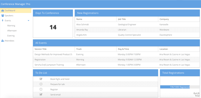
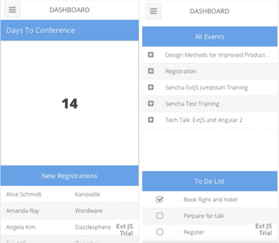
Team applied the following fundamental principles:
- Clarity
- Trust
- Familiarity
- Delight
- Digestibility
And proposed the following changes:
- Align different elements by keeping the weight, purpose, and hierarchy for a clutter free environment.
- Follow the same card style as in the existing design but enhance the overall layout that looks vibrant and contemporary, with clear and precise information required for an action.
- Consider the colors, typeface and the layout style of Sencha. The user is already familiar with the brand and just capitalize on it to make the user feel confident and convenient with consistency scheme.
- Make sure the flow from one screen to another to be smooth and consistent all through the app. Pop-Ups and upload functionality, overall built an exciting environment.
- Make sure the user should understand the purpose of the application and the elements without any explanation.
Engineering Team Proposal
In parallel, the engineering time reviewed Themer capabilities and they loved the following:
- Live theme update – With the new Inspect feature of Sencha Themer, team could connect to their live Ext JS application and style it. It was counter-intuitive though that the Themer does not show the actual application output for theming. You shall work with the Ext JS components inside the Themer and the changes would reflect in your application if that component was used.
- Super-easy theming of Ext JS components – All the CSS variables (that we see in API docs) have been made available as easy selection widgets (e.g. color picker to change color). Also, the variables have been clearly categorised as global and component specific. This makes it easier and faster to theme an application. One can theme a complex component like Grid in few minutes without having to understand the component or API docs.
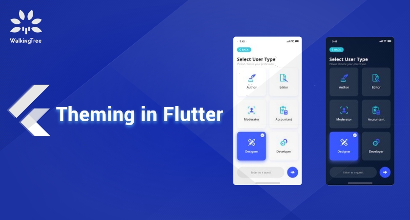
- UI support – ui is a config that is supported on various Ext JS components. It is a quick way to apply a set of styles to a component. Sencha Themer 1.1 added support for UI. One can create a custom UI from existing component UIs and use them in their application to see how they affect the component. E.g. create a red-cancel button ui to show a Cancel button in red.
- No more working with SASS and/or CSS – Being the most complete JavaScript framework out there, Ext JS has lot of components and each component supports fine-grained styling that can be driven by various configs, SASS variables and mixins. Theming a large application used to be a time consuming (1-2 months task). Themer simplifies that by taking away the need of writing SASS or CSS. Similar themes can now be produced in a week or two.
However, the team found the following limitations with Themer:
- Not every component is supported
- No support for cls configs
- Can not theme a custom component
- Can not theme XTemplate
- Themer does not generate component specific SASS files
- Can not import an existing theme package
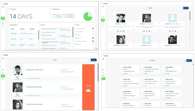
With the inputs from both the teams, this is what we submitted, finally, which incorporates UX as well as Theming for Desktop and Mobile:
Desktop
 Mobile
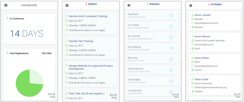
You may try the live demo and do share your comment/thought.
Summary
Overall, it was fun and we learnt a lot about Sencha Themer. Given where the current Sencha Themer stands, certainly, there are limitations (which is part of every product evolution journey) but it is promising enough to cut-down on the overall theming effort for an application from months to weeks. It is a product that can be given to either your UX team or to the development team and both of them would find it easier to work with and produce results. Whether you are looking at creating a unified theme with organisational branding guidelines and use them across applications or you just want to theme an application, the ROI is immediate.
Contact Us if you have question about how Sencha Themer can be good for your application delivery and how it can be aligned with your delivery process.


