

Blogs
Empower Data Visualization with Redash: The Modern-Day Business Solutions
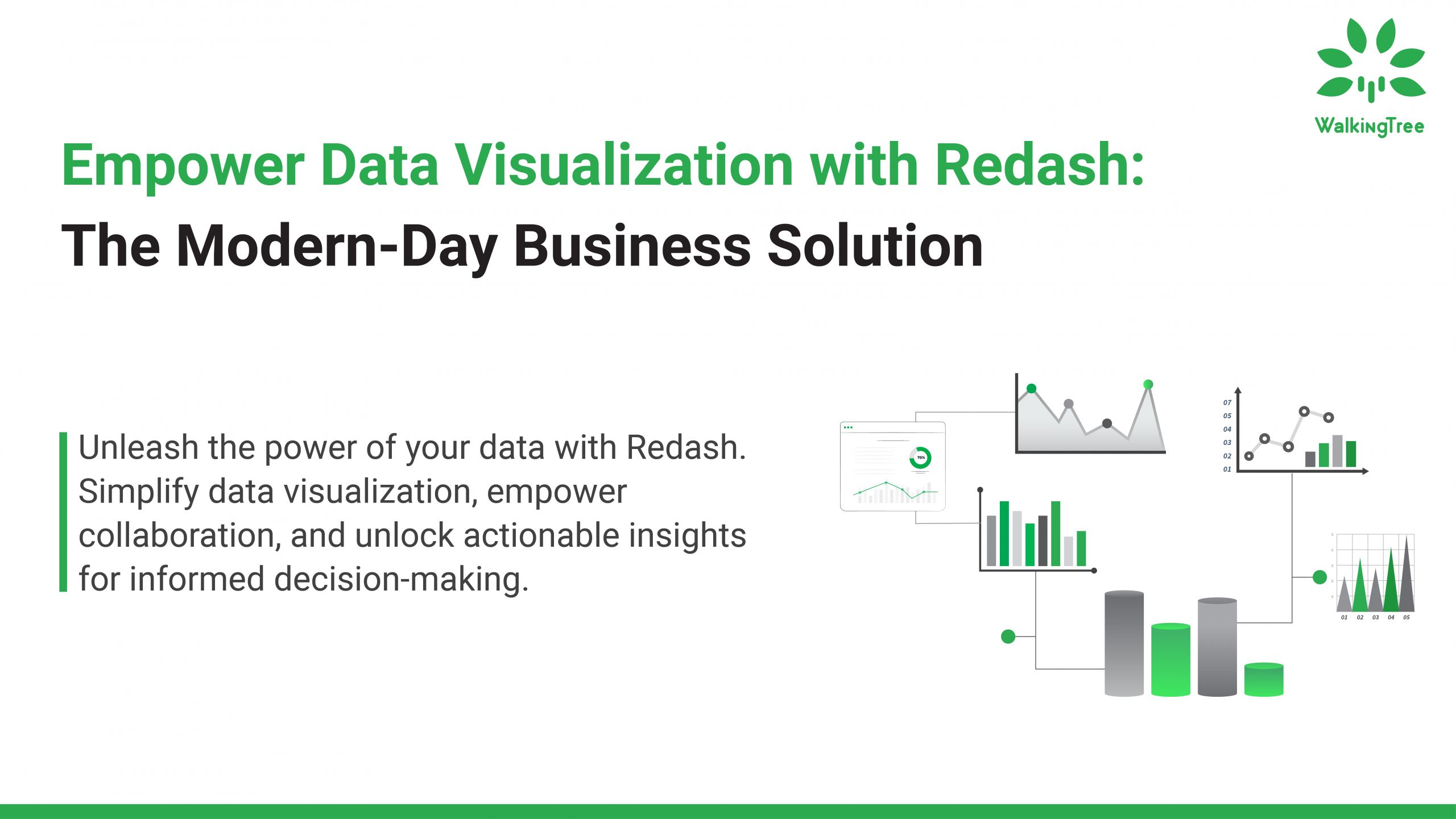

The business world thrives on actionable insights. Extracting clarity from complex data is no longer a bonus, it’s a necessity for navigating today’s competitive landscape. Data visualization isn’t a fad, it’s a fundamental tool that empowers businesses to make informed decisions and gain a strategic edge. Here’s where Redash comes in. This powerful platform helps businesses unlock the true potential of their data, transforming raw information into clear and actionable insights. This article delves into Redash’s history, key features, and integration capabilities, showcasing how it can become a game-changer for your organization.
|Data Visualization and Its Critical Role in Business
In the age of big data, businesses are constantly inundated with vast amounts of information. Critical insights can be hidden beneath the surface, hindering informed decision-making. Data visualization acts as your navigational aid, transforming raw data into clear and actionable visuals.
Why Visualizations are Essential for Business Success:
The following are some of the reasons why visualization takes precedence:
- Unveiling Hidden Patterns: Data visualizations uncover trends and relationships within complex datasets that might go unnoticed in spreadsheets. This empowers you to identify opportunities and proactively address potential issues.
- Engaging All Stakeholders: Charts, graphs, and maps translate complex data into a universally understood language. This fosters clear communication and collaboration across all levels of your organization.
- Data-Driven Decisions at Warp Speed: Visualizations expedite data analysis, allowing you to make informed choices faster. Automated dashboards and reports streamline the process, freeing up valuable time for deeper analysis.
- Enhanced Collaboration & Knowledge Sharing: Visual data becomes a shared focal point, facilitating focused discussions and ensuring everyone is working from the same insights. Sharing visual reports across departments promotes better alignment and knowledge transfer.
- Improved Data Quality & Accuracy: Visualization tools can help identify outliers and data inconsistencies, leading to cleaner and more reliable data. Regularly monitoring data visualizations encourages continuous improvement in data quality.
- Empowering Customer-Centricity: Data visualization helps you gain deeper customer insights. By understanding customer behavior and preferences, you can tailor services for increased satisfaction and loyalty.
WalkingTree leverages the power of data visualization to help businesses navigate the data deluge and unlock actionable insights. Contact us today to learn how we can transform your data into a strategic advantage!
|Redash: Empowering Data-Driven Decisions Across Your Organization
Redash goes beyond the boundaries of a typical data visualization tool. It functions as a robust framework specifically designed to cultivate a data-driven decision-making culture within organizations of all sizes.
Enhanced User Accessibility: Redash prioritizes user experience by offering an intuitive interface that streamlines data querying, visualization, and sharing. This user-centric approach eliminates technical barriers, fostering broader data utilization across all levels of your organization.
A Commitment to Innovation: Redash boasts a remarkable origin story. Conceptualized in 2013 by Arik Fraimovich, it initially emerged as a querying tool for PostgreSQL databases. However, Redash’s unwavering dedication to democratizing data access fueled its evolution to encompass diverse data sources, significantly expanding its functional scope and user base. Furthermore, Redash’s commitment to the open-source development model has been instrumental in its continuous growth, as it readily integrates valuable operational features that enrich its overall functionality.
|Visualization Options in Redash
Redash includes various types of visualizations, each one useful for his kind of thing:
- Table :
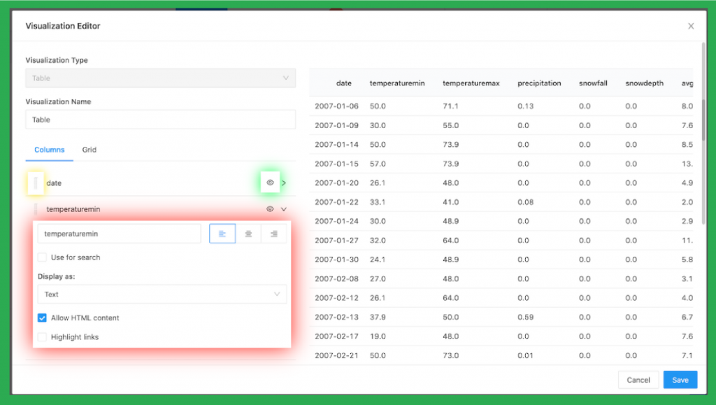
Redash tables offer a familiar starting point for data exploration. They provide a clear and concise view of your raw data, organized in rows and columns. But Redash doesn’t stop there. You can leverage its powerful customization options to extend these tables with calculated columns, unlocking deeper insights. This flexibility empowers you to structure your data precisely how you need it, making Redash tables an essential tool for anyone working with raw data.
- Charts and Graphs:
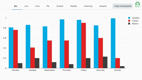
Redash offers a comprehensive suite of charts, from classic line and bar graphs to pie charts and area charts. These powerful tools allow you to compare quantities, analyze data distribution, and understand composition over time or for continuous data sets. With Redash charts, you can easily identify trends, spot anomalies, and make data-driven decisions with confidence.
- Maps:
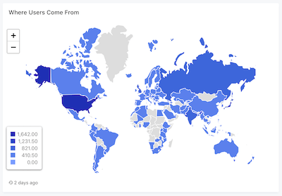
Redash empowers you to create insightful maps that reveal regional variations across a wide range of use cases. Analyze sales performance by region, track website traffic by country, or even map the spread of a disease. Redash maps provide a clear and impactful way to understand the geographical context of your data, offering valuable insights that traditional visualizations might miss.
- Pivot Tables:
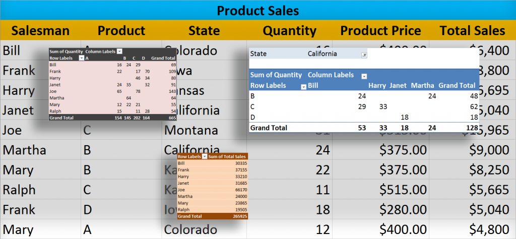
This powerful tool allows you to summarize and aggregate data across multiple dimensions, enabling flexible exploration and deep analysis. Imagine uncovering trends in sales by region and product category, dissecting website traffic by source and device type, or analyzing survey responses based on demographics and specific questions. Redash pivots empower you to slice and dice your data in countless ways, revealing hidden patterns and providing a comprehensive understanding of complex information.
- Counter :
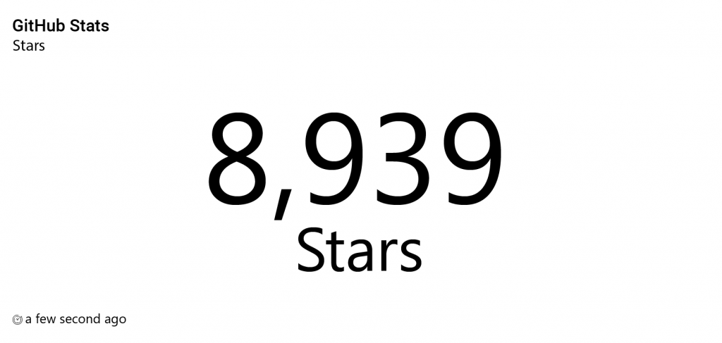
Keep a pulse on your key metrics with Redash single values. These simple yet powerful displays provide instant visibility into critical performance indicators (KPIs) and other essential data points. Redash allows you to showcase numbers, text, or even icons, making information readily available at a glance. Whether it’s monitoring total sales figures, tracking website visitor counts, or keeping an eye on error rates, Redash single values ensure you have the information you need, right when you need it.
- Sankey :
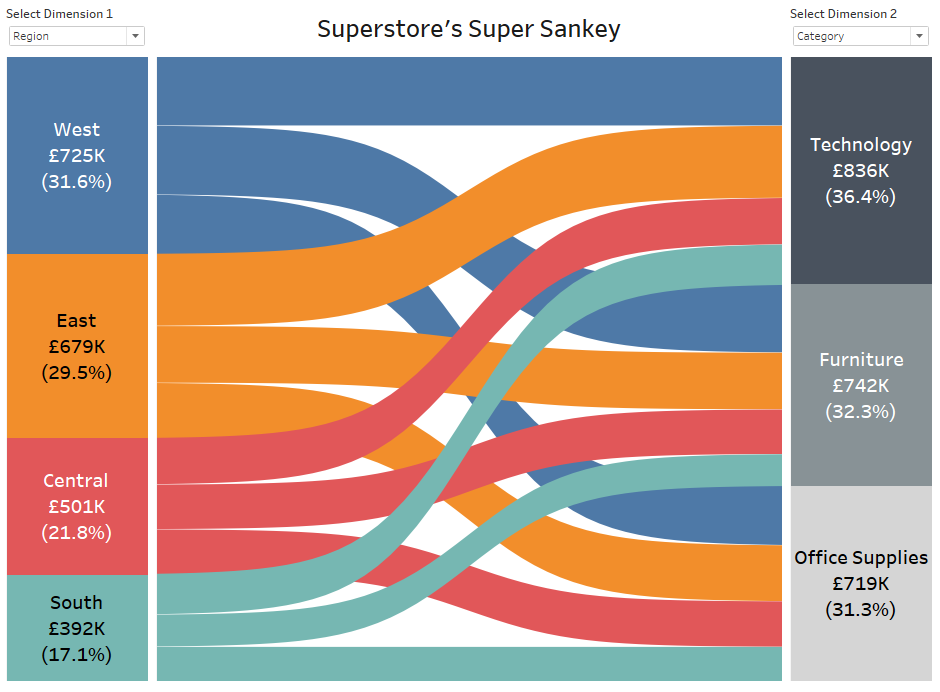
Unveil complex relationships with Redash Sankey diagrams. These powerful visualizations go beyond simple data points, revealing the flow and quantity of information between different stages or categories. Imagine understanding energy flow within a system, visualizing website navigation paths, or tracking the movement of funds between accounts. Redash Sankey diagrams utilize the width of “flows” to represent their magnitude, providing a clear and insightful view of how data moves and interacts within your system. This powerful tool helps you identify bottlenecks, optimize processes, and gain a deeper understanding of complex relationships within your data.
- Sunburst :
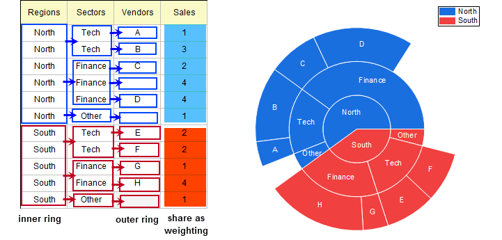
Redash Sunburst charts excel at portraying data organized in a layered structure. Each concentric ring represents a level within the hierarchy, making it easy to understand relationships between various components. Imagine visualizing intricate file system structures, dissecting organizational charts, or navigating product category breakdowns. Redash Sunburst charts utilize clear and intuitive visuals to depict hierarchical data, providing a quick grasp of how elements are organized and interconnected within your information landscape. This powerful tool empowers you to explore complex structures with ease and gain valuable insights into their composition.
- Word cloud :

Redash word clouds capture the essence of your text data by highlighting frequently used words. Words appear larger based on their frequency, creating a clear picture of the most prominent themes and topics within your content. Redash word clouds are ideal for analyzing large volumes of text, such as customer reviews, social media conversations, or survey responses. They offer a quick and insightful way to grasp the core concepts and identify key areas of focus within your textual data.
|Creating a Visualization in Redash
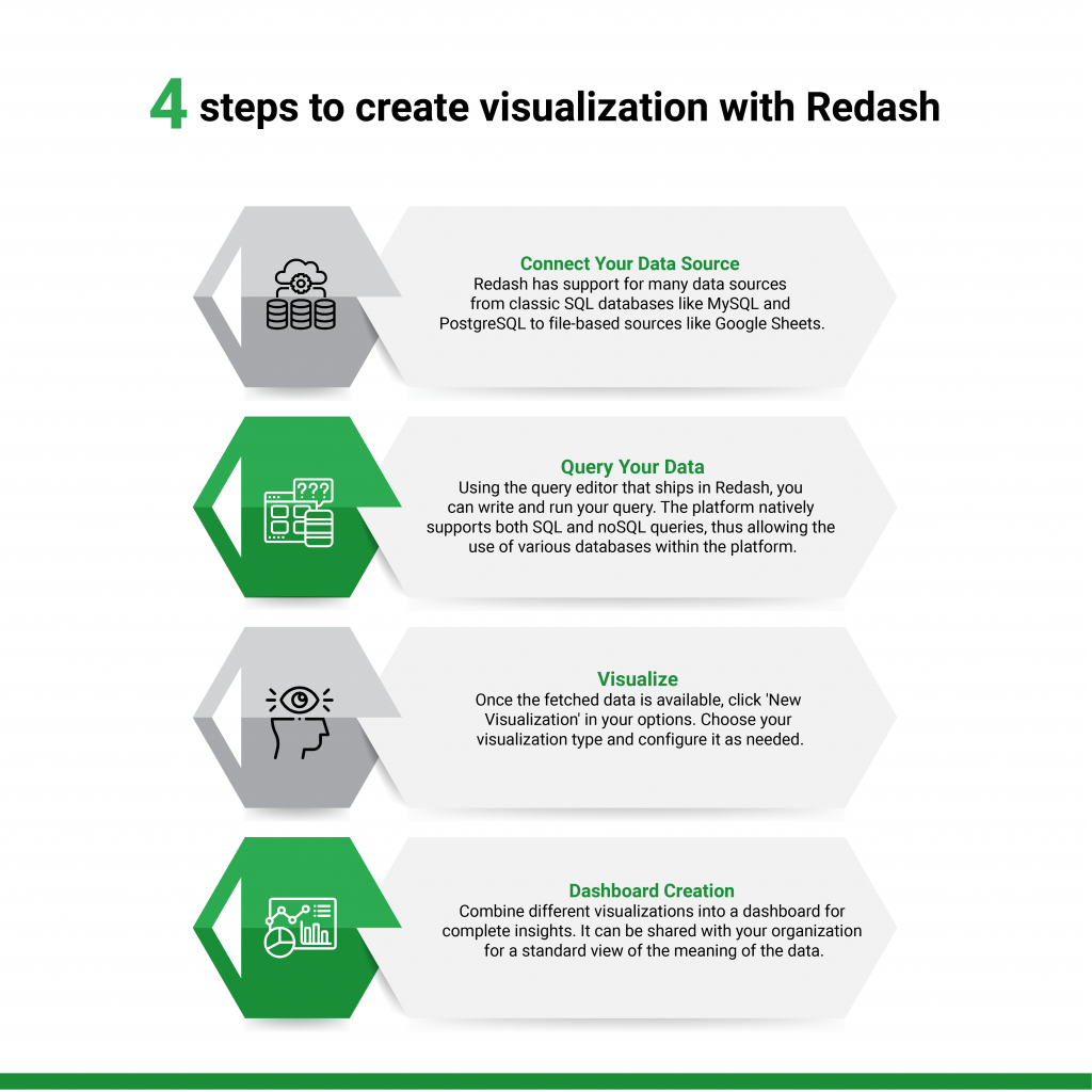
The process of creating a visualization in Redash goes through the following flow:
- Connect Your Data Source: Redash has support for many data sources: from classic SQL databases like MySQL and PostgreSQL to file-based sources like Google Sheets.
- Query Your Data: Using the query editor that ships in Redash, you can write and run your query. The platform natively supports both SQL and noSQL queries, thus allowing the use of various databases within the platform.
- Visualize: Once the fetched data is available, click ‘New Visualization’ in your options. Choose your visualization type and configure it as needed.
- Dashboard Creation: Combine different visualizations into a dashboard for complete insights. It can be shared with your organization for a standard view of the meaning of the data.
|Connect with Other Data Sources
This is the crucial advantage of using Redash. It has direct connectivity with all mainstream database systems and many cloud services. It can perform queries on APIs for additional flexibility. This ensures businesses can capitalize on their existing technology investments, even in the area of data analysis. You can find the complete list of connectors here: https://redash.io/integrations/
|Advantages of Using Redash
Redash empowers organizations to unlock the true value of their data, regardless of technical expertise. Here’s how:
- Accessibility for All: Redash’s intuitive interface makes data exploration a breeze. Even non-technical users can easily query, visualize, and share data, fostering a more data-driven culture across the organization.
- Collaboration Made Simple: Redash facilitates seamless collaboration by enabling users to share and discuss visualizations and dashboards. This fosters teamwork and ensures everyone is working from the same insights.
- Real-Time Decisions: Redash integrates with numerous live data sources, allowing users to access and analyze the latest information as it happens. This empowers data-driven decision-making in a fast-paced environment.
|Redash: Democratizing Data for Everyone
Redash is not just visualization but a full-fledged platform for converting data into a strategic asset of your business. Whether you’re a startup or a large enterprise, Redash gives you the tools to understand your data to make decisions that will drive your company forward. Dive deep into Redash and unleash your data potential, setting new benchmarks not only for your business intelligence but also for competitiveness.